

13 Pastel Wedding Ideas That Feel Soft, Romantic, and Anything but Basic
Quick Answer: The best pastel wedding ideas mix soft blush, lavender, sage, and buttercream tones across candles, linens, florals, and cake design — layered with texture like satin, chiffon, and dried petals so the palette feels romantic and intentional, not childish or one-note.
You already know pastels are having a moment — but pulling them off without your reception looking like a candy shop takes a little strategy. The trick is layering: soft color against soft color, with texture and a few grounding details doing the heavy lifting.
Below is a full gallery of pastel wedding moments, from aisle to cake table, each one built to feel elevated rather than expected. Grab what speaks to you and mix it with your own palette.
This post may contain affiliate links, please refer to privacy policy for more information.
Dreamy Ceremony Moments
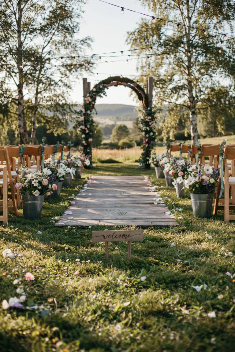
1. A Rose Petal Aisle That Floats Like Confetti

Instead of a straight, tidy petal line, this aisle uses an uneven, wind-blown scatter — heavier near the arch, thinning out as it moves back — so it reads like the petals landed there naturally rather than being placed by hand.
Why You’ll Love It
It photographs beautifully from behind the guests, catching light and color in every frame without needing real flowers that wilt before the ceremony starts.
Best For
Outdoor ceremonies on grass, gravel, or a wooden aisle runner where petals can scatter naturally. These pastel silk rose petals in pink, blue, and yellow hold their color in sun and won’t crush like fresh petals.
2. A Shepherd’s Hook Aisle Lined With Mason Jar Bouquets

What makes this aisle marker stand out is the height — instead of low ground arrangements, the bouquets sit at shoulder level, so guests walk through a corridor of color rather than looking down at it.
Styling Tips
Alternate jar heights slightly down the aisle for a less rigid, more garden-party feel. Add a thin ribbon bow at the jar handle to tie in your wedding party’s colors.
Good to Know
This aisle decoration set with pastel bouquets, mason jars, and shepherd’s hooks comes as eight complete sets, so you can decide how many pairs your aisle actually needs before buying extra.
3. A Flower Garland Arch Dripping in Wildflowers

Rather than a tight, uniform floral wall, this arch leans into asymmetry — garland bunched heavier on one side, thinning across the top, with a few tendrils left to move in the breeze.
Why It Stands Out
The wildflower texture keeps it from feeling too polished or “done,” which is exactly what makes pastels read as romantic instead of manufactured.
Best For
Couples who want a full, garden-lush arch without a florist’s per-stem pricing. These pastel wildflower garlands come in six long strands, enough to fully wrap a standard arch or drape a backdrop.
Tablescapes That Feel Fresh, Not Forced
4. Satin Runners in a Rainbow of Soft Hues
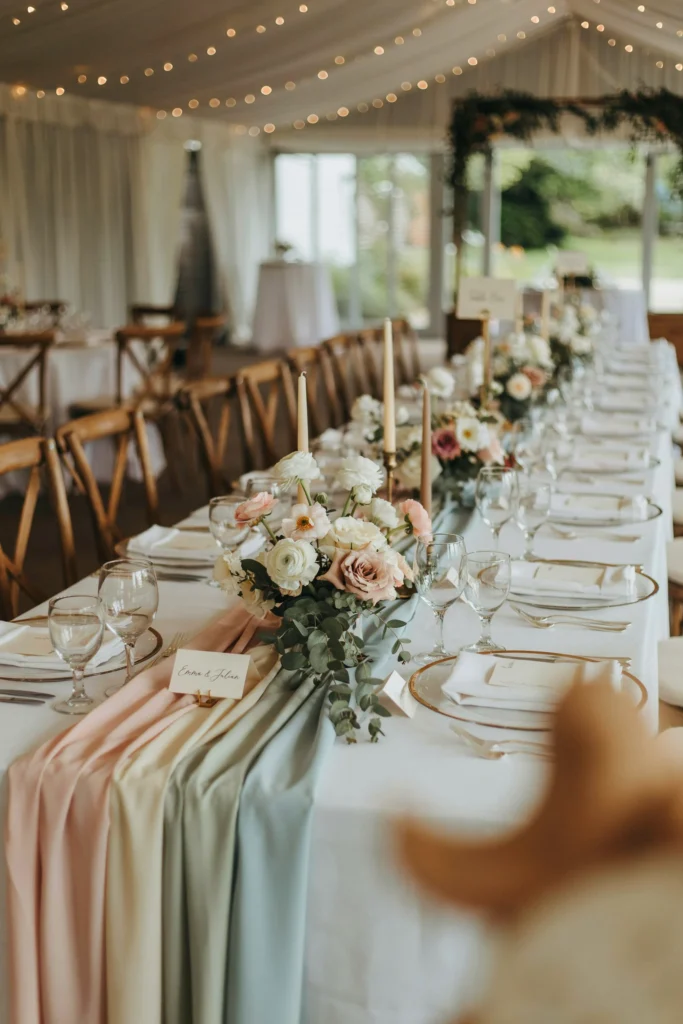
Crossing two runners in different pastel shades at each place setting — rather than one runner down the center — gives the table movement and keeps a monochrome palette from going flat.
Pair It With
Simple white or ivory tablecloths as a base, letting the pastel rainbow satin table runners do the color work without competing linens underneath. For more layout ideas on getting this balance right, this guide to spring tablescapes that feel fresh, not forced is worth a look.
5. Tall Taper Candles Glowing in Pastel Rows

Grouping candles in threes and fives at varying heights — instead of one uniform row — creates a soft, uneven candlelight glow that reads as elegant rather than sparse.
Budget Tip
A single box of 60 pastel taper candles covers a large guest table with plenty left for the sweetheart table and cake display, at a fraction of florist-supplied candle pricing.
6. A Centerpiece Built From Odds and Ends

The charm here is intentional imperfection — no two containers match, no two stems are the same color, yet the overall cluster reads as one cohesive, collected-over-time centerpiece.
Why You’ll Love It
It costs less than a single large arrangement and gives guests something interesting to look at up close instead of one big, blocking floral centerpiece. For more ways to build a centerpiece that doesn’t rely on a florist’s full budget, see this spring wedding centerpiece ideas roundup.
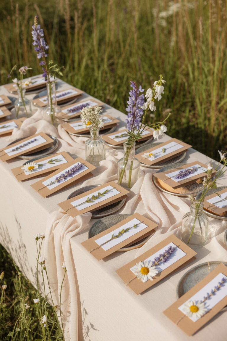
7. Budget-Friendly Place Settings That Still Feel Elevated

Layering two plate sizes in slightly different pastel shades at each place setting mimics a formal charger-and-plate look without the cost or rental logistics of real china.
Good to Know
This 360-piece pastel rainbow dinnerware set serves 48 guests with plates, napkins, cups, and cutlery included, ideal for backyard or barn receptions without a full rental order.
8. Tablecloths That Set the Mood Before the Food Arrives

Instead of matching every table, this look assigns a different pastel tone per table, so the whole room reads as one gradient when guests walk in rather than a single flat color.
Best For
Large guest counts where full linen rentals would blow the decor budget. These pastel disposable tablecloths come in a 14-pack, enough to dress most mid-size reception layouts.
Which Pastel Palette Fits Your Vibe?
Not every pastel combination reads the same way. Use this to narrow down a direction before you start buying decor.
| Palette | Mood | Best For | Cost to Style |
|---|---|---|---|
| Blush, sage, and gold | Romantic, timeless | Garden or vineyard venues | $$ |
| Soft blue, ivory, and silver | Airy, modern | Ballroom or indoor venues | $$$ |
| Lavender, cream, and copper | Whimsical, warm | Barn or rustic venues | $$ |
| Full pastel rainbow (pink, blue, yellow, mint) | Playful, joyful | Casual backyard or brunch weddings | $ |
Bouquets & Florals Worth Copying
9. A Bridal Bouquet Wrapped in Frayed Chiffon Ribbon

Leaving the ribbon ends raw and frayed instead of cutting them clean adds a soft, handmade texture that keeps an otherwise simple bouquet from looking store-bought.
Why It Stands Out
The frayed chiffon catches light differently than smooth satin, giving the bouquet visual texture even in photos where the flowers themselves are small in frame. This pastel macaron chiffon ribbon comes in a full spool, enough for the bouquet plus matching bridesmaid wraps. For more bouquet-building inspiration, this spring wedding bouquets guide breaks down shapes and stem counts by season.
10. Loose, Garden-Style Arrangements
[IMAGE PLACEHOLDER: An oversized, unstructured bouquet with trailing greenery and mixed pastel blooms at different heights, held loosely rather than in a tight dome shape.]
Letting stems fall at natural, uneven lengths instead of trimming everything to one height is what gives this bouquet its just-picked-from-the-garden feel.
Pair It With
Trailing greenery like jasmine vine or fern to add movement without adding more color. For a full breakdown of which blooms hold pastel tones best by month, see this spring wedding florals guide.
Sweet Treats Worth the Spotlight
11. A Pastel Cake That Looks Hand-Painted

The watercolor effect — color concentrated low and fading upward — gives a plain buttercream cake the look of a hand-painted piece without needing a fondant specialist.
Worth the Splurge?
A skilled buttercream artist can usually replicate this ombré blend for close to the price of a standard tiered cake, making it one of the more affordable “wow” details on this list. For more pastel cake styles and how to request them from your baker, this spring wedding cake ideas guide has specific examples to bring to a tasting.
Budget Guide: Ideas for Every Wallet
Pastel weddings can be styled at nearly any price point — here’s where to spend and where to save.
| Detail | Splurge Option | Budget-Friendly Swap |
|---|---|---|
| Tableware | Rented china and linens | Coordinated disposable pastel dinnerware |
| Centerpieces | Full florist arrangements | Mixed bud vases with single stems |
| Aisle décor | Fresh petals + florist-built arch | Silk petals + garland wrap on an existing arch |
| Lighting | Custom chandeliers | Grouped taper candles at varying heights |
Photo Moments & Personal Touches
12. A Balloon Column Backdrop for Golden-Hour Photos

Building the columns with graduated color — pale at the base, deepening near the top — gives a playful decor element enough visual weight to hold its own in formal portrait backdrops.
Best For
Couples who want a bold, colorful photo moment without committing to a full floral installation. This pastel balloon column stand kit includes two adjustable stands and 100 balloons, enough for a full arch flanking display.
13. A Watercolor-Framed Escort Card Display
![A long table with dozens of small pastel watercolor picture frames, each holding a guest's name and table number, arranged in loose rows.]](https://luxelocksstudio.com/wp-content/uploads/2026/07/pastel-wedding-ideas-6-683x1024.webp)
Using frames instead of flat cards turns the escort table into a display guests actually stop and look at, and doubles as a favor guests can take home with their photo later.
Good to Know
This 50-pack of pastel watercolor picture frames fits standard 4×6 photos, so the same frames can hold escort cards during the reception and family photos afterward.
Choosing Your Signature Pastel Theme

Before booking a single vendor, the strongest pastel weddings commit to one clear direction — garden romantic, modern minimalist, or playful rainbow — and carry it through every detail instead of mixing all three.
A defined theme makes every decision after this one faster, from florals to invitations to what the wedding party wears. This spring wedding themes guide walks through several complete directions to help you land on yours.
Common Mistakes to Avoid
- Using too many pastel shades at once: More than three or four colors together starts to look chaotic instead of soft. Pick a lead color and let the rest support it.
- Pairing pastels with stark white or black: High-contrast neutrals can wash out the softness pastels are meant to create. Ivory, cream, and soft wood tones ground the palette better.
- Skipping a metallic or dark accent entirely: An all-pastel palette with nothing to anchor it can read young. A touch of gold, copper, or deep green fixes this instantly.
- Not accounting for lighting: Pastels shift dramatically under fluorescent venue lighting versus natural light — always check your colors in the actual reception space before finalizing.
Frequently Asked Questions
What’s the difference between blush and dusty rose?
Blush is a lighter, pinker pastel with almost no gray undertone, while dusty rose leans more muted and mauve. Both work in pastel palettes, but dusty rose reads slightly more sophisticated for formal weddings.
Can you do an all-pastel wedding without it looking babyish?
Yes — the key is limiting your palette to three or four shades, adding a metallic or dark green accent, and choosing elegant textures like satin and dried florals over anything glossy or overly saturated.
What color goes with pastel blue?
Ivory, soft peach, and dusty lavender all pair naturally with pastel blue, and a touch of silver or gold keeps the combination from feeling flat.
Is a pastel wedding still trendy?
Soft, muted palettes have held steady in wedding design for several seasons and continue to appear across real weddings, especially for spring and garden-style venues.
What’s the cheapest way to style a pastel wedding?
Disposable coordinated dinnerware, silk petals instead of fresh, and DIY bud vase centerpieces cut costs significantly while still delivering a full pastel look.
![A softly lit barn reception at golden hour, string lights overhead, a long wood table set with terracotta linens and a pampas grass runner, guests in flannel and velvet visible in the blurred background.]](https://luxelocksstudio.com/wp-content/uploads/2025/06/rustic-fall-wedding-1-768x1152.webp)


