30 Pink Wedding Ideas That Are Romantic, Stylish, and Totally Save-Worthy
Quick Answer: Pink weddings range from whisper-soft blush to saturated hot pink — the key is choosing one anchor shade and building your entire palette around it. Use pink in your florals, bridesmaid dresses, table linens, stationery, or wedding cake for maximum impact. These 30 ideas cover every shade, budget, season, and style.
Pink has been a wedding color forever — and it’s never going out of style. What’s changed is how brides are using it. We’ve moved well past the era of pastel-everything and into a world where a single confident shade of pink, layered thoughtfully through flowers, linens, lighting, and cake, creates something genuinely memorable.
Whether you’re dreaming of a romantic blush garden ceremony, a moody dusty rose winter wedding, or a bold hot pink celebration that nobody will forget, pink gives you more range than almost any other wedding color. The trick is committing to your shade and letting everything else follow.
These 30 pink wedding ideas will take you from the softest whisper of blush to the deepest, most dramatic rose — with real inspiration for every budget, every season, and every style of bride.
This post may contain affiliate links, please refer to privacy policy for more information.
Soft & Romantic: Blush and Petal Pink Ideas
1. Blush Peony Arch with Trailing Greenery
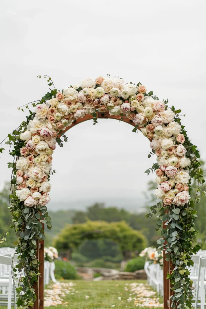
Soft blush peonies are packed so densely that the arch disappears beneath them — all you see is a cloud of petals in the most delicate shade of pink imaginable. The eucalyptus that spills down the sides adds enough structure to keep it from looking purely soft, and the green-against-blush contrast is what photographers live for.
Why You’ll Love It
Peonies photograph beautifully in every lighting condition, from bright outdoor midday to candlelit evening reception. This arch style works as a ceremony backdrop and doubles as a photo opportunity your guests will actually use.
Styling Tips
Match your bouquet flowers to the arch — peonies, garden roses, and ranunculus all in the same blush palette creates cohesion without looking matchy-matchy. Keep your other floral arrangements simpler so the arch remains the focal point. For a natural, organic look, ask your florist to leave a few stems at irregular lengths rather than cutting everything to the same level.
2. Blush Silk Ribbon-Wrapped Bouquet
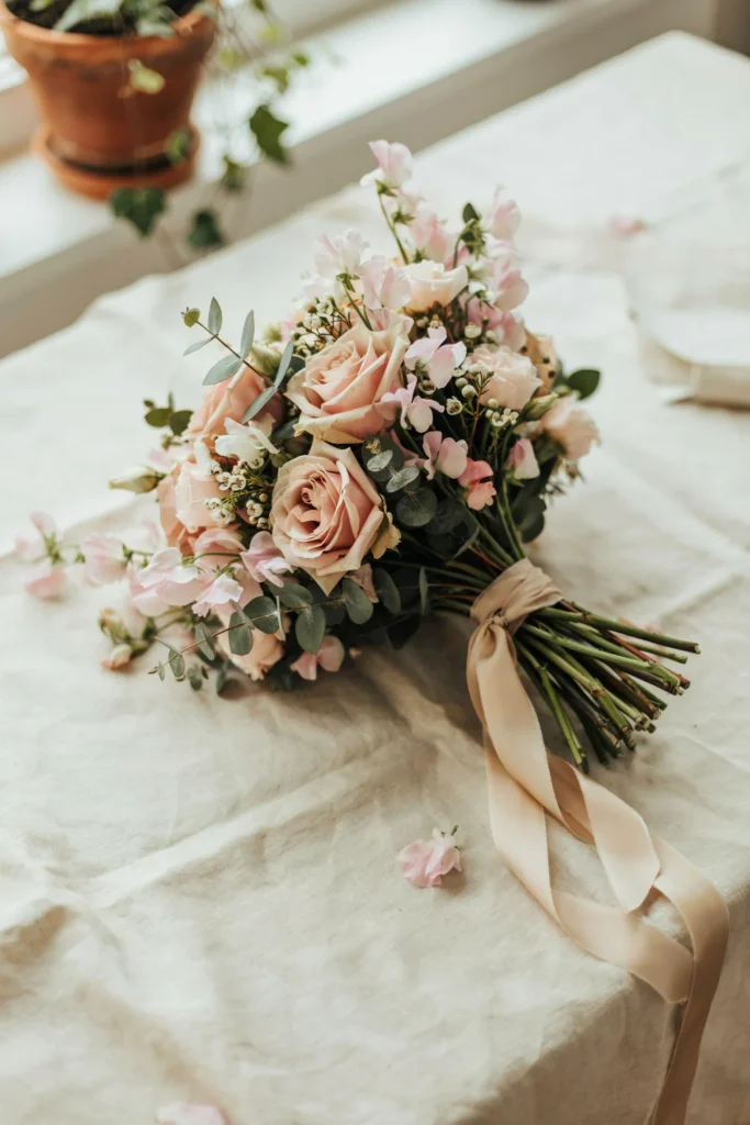
The bouquet itself is almost secondary to that ribbon — a length of blush silk ribbon wrapped loosely around the stems and left to trail past the bottom creates a softness and movement that no other bouquet finish can match. It catches the breeze, it photographs beautifully mid-walk, and it feels genuinely romantic rather than styled.
Best For
Garden weddings, outdoor ceremonies, and spring or early summer dates when the light is warm and the photos are going to do a lot of the work for you.
Styling Tips
Choose a ribbon that’s a half-shade lighter or darker than your flowers rather than matching exactly — the tonal variation adds depth. Ask for the ribbon ends to be cut on a diagonal so they don’t fray. This detail works equally well for bridesmaids’ bouquets to tie the look together.
3. Blush Table Runner with Rose Gold Accents

A sheer blush table runner laid over a white tablecloth creates the kind of softness that makes a banquet table look effortlessly romantic. The rose gold candle holders running down the center catch the light as the evening progresses and shift the entire table from soft and romantic to warm and intimate.
Why It Stands Out
Most blush tables lean entirely into soft and pale — adding rose gold metallics gives the table some drama and luxury without introducing a new color into the palette. The warmth of rose gold reads as a deeper, more saturated version of blush, which is exactly why it works.
Styling Tips
Add gold flatware alongside rose gold decor for a layered metallic effect that photographs beautifully. Keep floral centerpieces low so guests can see each other across the table — blush roses or ranunculus in short bud vases work perfectly here. Use blush cloth napkins folded at each place setting to carry the palette from the table runner all the way through the table setting.
4. Blush Goblet Place Settings
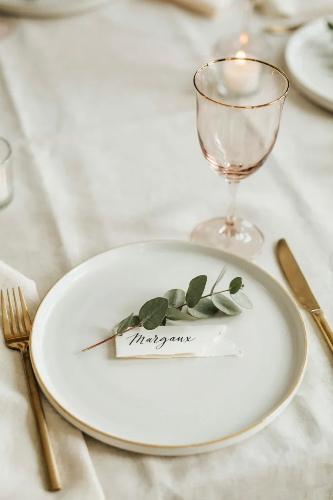
There’s something about coloured glassware that immediately elevates a table from “nicely set” to “designed.” A single blush goblet at each place setting introduces pink through an unexpected object — not flowers, not fabric, but glass — and the way it glows when light passes through it is genuinely beautiful.
Best For
Brides who want a cohesive pink palette without an entirely pink table. This is also a brilliant option for venues that don’t allow open flames — the glassware adds the warmth and glow that candles would otherwise create.
Pair It With
Gold charger plates, ivory linens, and a low centerpiece of blush and white florals. The goblets do enough work on their own — keep everything else clean and simple. Gold flatware completes the look and ties the metallic through the setting.
5. Blush Chair Sashes on White Chairs

White chairs with blush chair sashes tied at the back in a loose bow create ceremony aisle styling that’s both classic and current. The sash softens the chair without overwhelming it — the focus stays on the aisle, on the couple, on the moment.
Budget Tip
Chair sashes are one of the most cost-effective ways to introduce pink throughout your ceremony space. Dress just the aisle chairs — no one notices the unchaired rows once the ceremony begins, and the aisle is what photographs anyway. Use the savings on your florals where they’ll have more visual impact.
Styling Tips
Tie the sashes in a simple loose knot rather than a full bow for a more modern look. Tuck a small sprig of eucalyptus or baby’s breath into the knot for a subtle botanical touch. Keep the petal color on the aisle consistent with the sash shade so the whole aisle reads as one intentional element.
Which Pink Shade Is Right for Your Wedding?
Before you commit to decor, florals, and bridesmaid dresses, it’s worth knowing exactly which shade of pink you’re working with. These shades are not interchangeable — they have different undertones, photograph differently, and suit different venues and seasons. Use this table as your starting point.
| Shade | Vibe | Best Season | Pairs With | Best Flowers | Photography Tip |
|---|---|---|---|---|---|
| Blush | Soft, romantic, timeless | Spring, Summer | Ivory, gold, sage green, champagne | Peonies, garden roses, ranunculus | Looks luminous in golden hour; can wash out in harsh midday sun — schedule portraits for late afternoon |
| Dusty Rose | Earthy, vintage, moody | Fall, Winter | Burgundy, terracotta, mauve, sage | Dried roses, dahlias, cosmos | Rich and warm in low light; pairs well with candlelit evening receptions |
| Millennial Pink | Modern, editorial, confident | Year-round | White, copper, terracotta, nude | Anthurium, tulips, standard roses | Bold and graphic in photos; works beautifully against white walls and minimalist venues |
| Hot Pink | Bold, festive, maximalist | Summer, destination | White, black, gold, lime green | Tropical blooms, carnations, gerbera | Vibrant and high-contrast in photos; watch for color cast on skin tones in close-up portraits |
| Mauve / Rose Gold | Sophisticated, modern, luxe | Fall, Winter, year-round | Champagne, dusty lavender, greige, bronze | Lisianthus, amnesia roses, astilbe | Subtle and luxurious on film; glows beautifully under warm amber lighting |
If you’re still not certain — take this table to a fabric store and pull swatches. Seeing the actual shade against your skin, your venue’s floor, and your florist’s samples is the only way to know for certain. Knowing the name of a color is not the same as knowing how it will look in the room.
Dusty Rose & Vintage Rose: Moody and Romantic Ideas
6. Dusty Rose and Dried Flower Ceremony Arch

This arch has the kind of texture that fresh flowers simply cannot create. Dried pampas grass fans out at the top, dusty rose dried roses provide the color, and lunaria adds translucent silver rounds that catch the light differently at every angle. It’s the kind of ceremony backdrop that looks like it belongs in an editorial shoot — but it’s actually within reach for most wedding budgets.
Why It Stands Out
Dried florals don’t wilt, don’t require a florist on-site the morning of, and can often be rented or repurposed after the wedding. For brides marrying in the fall or winter, this aesthetic is significantly more seasonally appropriate than fresh peonies would be.
Styling Tips
Keep the arch asymmetrical — heavier on one side — for a more organic, editorial look. This style photographs exceptionally well against brick, wood, or warm-toned stone venues. Pair with a fairy garden wedding aesthetic for a romantic and slightly whimsical feel.
7. Dusty Rose Bridesmaid Dresses in Mixed Shades

The mismatched bridesmaid trend isn’t going anywhere, and dusty rose is the perfect shade for it precisely because it reads differently in different fabrics. A matte chiffon looks almost mauve. A satin catches the light and reads warmer, more pink. Together they create a tonal range that’s more interesting than a row of identical dresses — and far more flattering across different skin tones.
Best For
Brides with a bridal party spread across different body types, skin tones, and comfort levels in dresses. Letting bridesmaids choose their own silhouette in a coordinated shade range gives everyone a dress they’ll actually feel good in — which shows in every photo.
Styling Tips
Set one clear rule: dusty rose only, no corals, no warm pinks. The variation in fabric is what creates the beautiful tonal effect — if the shades themselves vary too much, the cohesion is lost. Tie the look together with matching blush silk ribbon bouquet wraps for all bridesmaids.
8. Dusty Rose Wedding Cake with Pressed Flower Details
![A three-tier cake in a matte dusty rose buttercream, with pressed dried flowers scattered across the surface and gold leaf accents at the base of each tier]](http://luxelocksstudio.com/wp-content/uploads/2025/12/pink-wedding-ideas-22-683x1024.webp)
Matte buttercream in dusty rose has a tactile quality that makes you want to reach out and touch it. The pressed flowers pressed gently into the surface look almost like the cake has been collecting botanical specimens — it’s art-adjacent in the best possible way. Gold leaf at the tier bases adds the luxury detail without competing with the flowers.
Why You’ll Love It
This style bridges the gap between the currently trending “minimalist cake” and the always-loved “floral wedding cake” — it’s neither plain nor overdone. The pressed flowers also mean your baker doesn’t need to pipe elaborate designs, which can reduce cost compared to fully hand-decorated cakes.
Styling Tips
Ask your baker to vary the flower placement — don’t space them evenly around every tier. Clusters in one corner of each tier look more editorial than a repeated all-over pattern. For more pink cake inspiration, explore these bright magenta wedding cake ideas or these beautiful fairy wedding cake designs.
9. Dusty Rose Stationery Suite with Wax Seal

Dusty rose stationery has a warmth and depth that standard blush can’t match — particularly when printed on a textured cotton paper that emphasizes the matte quality of the color. The wax seal on the envelope is the detail that transforms an invitation into a keepsake. Guests keep envelopes with wax seals. It’s a fact.
Best For
Brides who care about the unboxing moment — the experience guests have when they open the invitation before they ever arrive at the wedding. Stationery is often the first physical impression your wedding makes.
Styling Tips
A wax seal kit lets you DIY the envelope sealing at home with a custom monogram stamp — this is one of the most achievable DIY wedding projects even for brides who aren’t particularly crafty. Use a dusty rose wax color for harmony with the envelope, or a complementary gold wax for contrast. Print the inner envelope in ivory to create a layered effect.
10. Dusty Rose and Sage Green Color Palette
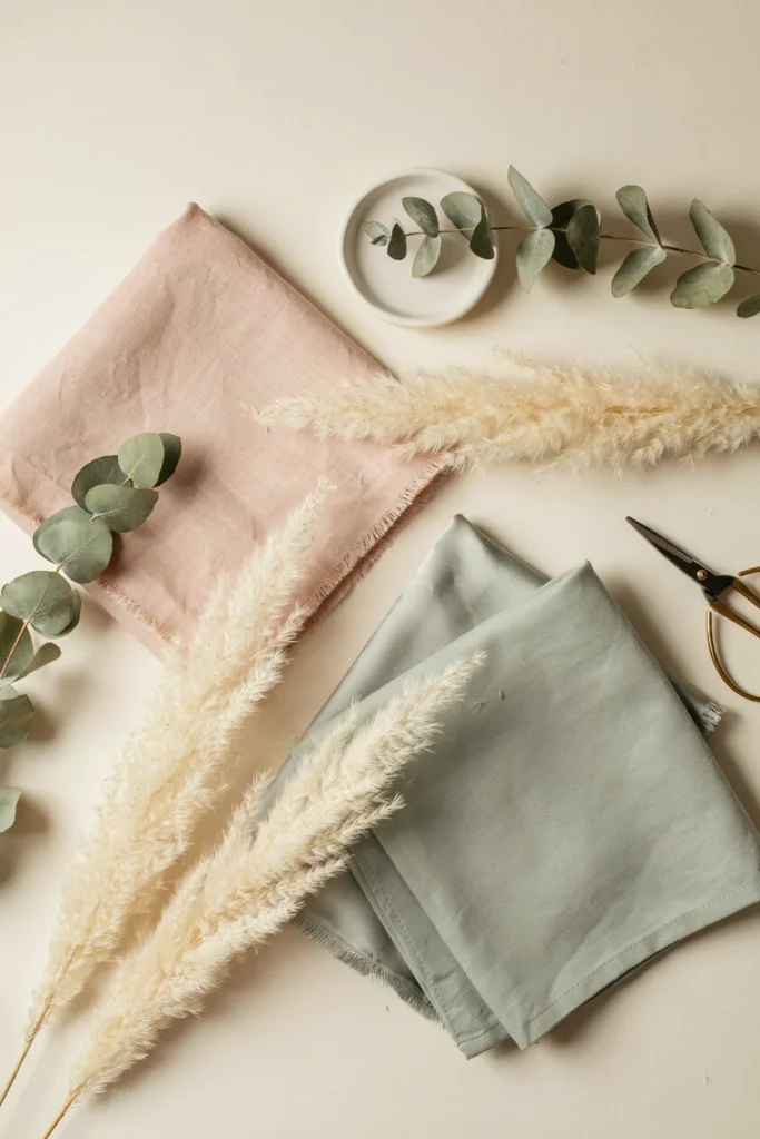
Dusty rose and sage green is one of the most balanced and photographically stunning wedding color combinations available. The cool green grounds the warmth of the rose and creates contrast without introducing a third dominant color. Every photo taken with this palette looks effortlessly styled.
Why It Stands Out
This palette works in every season but particularly shines in fall and early winter when deep green foliage and muted rose tones feel seasonally aligned. It’s a combination that still looks fresh without chasing a trend. For the full picture on how to build a spring wedding color palette around rose and green, that resource is worth bookmarking too.
Styling Tips
Use sage green in your largest fabric elements — bridesmaids’ dresses or table linens — and dusty rose in your florals and stationery. Reversing this (rose-dominant fabric, green florals) tends to read as a garden party rather than a wedding. Add ivory as a neutral throughout to keep the palette from reading too dark.
Hot Pink & Bold: Statement Wedding Ideas
11. Hot Pink Aisle Floral Accents

Hot pink against white creates the most graphic, high-contrast ceremony backdrop possible. These tall aisle arrangements command the space — the bride walking between them becomes the focal point in the most dramatic way. This is the kind of ceremony entrance that makes guests go quiet.
Why You’ll Love It
Hot pink floral arrangements create incredible photographs, particularly in venues with clean white or neutral walls that don’t compete with the color. The contrast is bold enough to look intentional and confident, not accidental.
Best For
Brides who want a statement ceremony space and a color palette that photographs with energy rather than softness. This works beautifully in modern venues, art galleries, and contemporary ballrooms. Also stunning for destination weddings where tropical blooms are locally available and cost-effective.
12. Hot Pink Wedding Cake as the Statement Piece

Hot pink cake against white wedding linens and a neutral venue is a design choice that doesn’t need any other explanation. The cake becomes the room’s focal point the moment it’s wheeled in. White flowers at the tier joints add contrast without softening the impact, and a simple gold topper keeps the top clean rather than competing.
Good to Know
Hot pink fondant is a specific skill — not all bakers achieve the right saturation reliably. Before booking, ask to see examples of their pink cakes specifically, not just their general portfolio. Also request a sample slice to confirm the fondant-to-cake ratio won’t make the flavors feel overwhelmed by the covering.
Styling Tips
Keep the cake table simple: a white tablecloth, a few white florals, and the cake itself. The color does all the work. Consider a tiered display stand in gold or white — a gold tiered stand for your dessert table can carry the metallic theme through every sweet element. More bold cake ideas: bright magenta wedding cake ideas are well worth exploring.
13. Hot Pink and White Maximalist Tablescapes
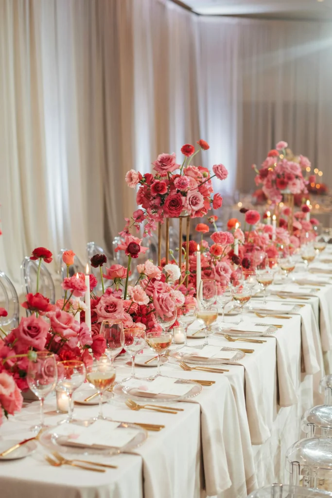
Maximalism done right isn’t chaos — it’s abundance with intention. Hot pink florals in three different heights create movement down the table, white candles and linens provide the visual rest between color bursts, and a champagne coupe at every setting adds the vintage glamour that makes the whole table feel celebratory rather than just decorative.
Why You’ll Love It
Maximalist tables look extraordinary in photos and feel generous and festive for guests. Abundance signals celebration — and hot pink with white is a combination bold enough to carry that energy without looking haphazard.
Styling Tips
Vary your floral vessels — tall cylinder vases next to low bowls next to bud vases — to create height variation naturally. Mix in white blooms with the hot pink rather than going all-pink on the florals; the break creates visual breathing room. Use gold flatware rather than silver — gold’s warmth reads better next to hot pink than silver’s cool undertones.
14. Hot Pink Bridesmaid Dresses with White Bouquets
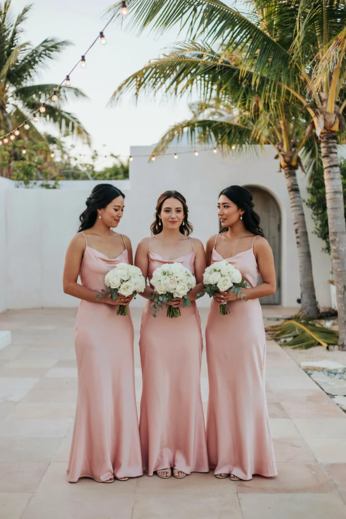
The contrast is the point: saturated hot pink dresses against completely white bouquets creates a crisp, graphic pairing that photographs with the energy of an editorial shoot. Satin fabric amplifies the color beautifully in outdoor light and catches shadows that give the gowns depth in photos.
Best For
Destination weddings, summer celebrations, and outdoor receptions where bright color and abundant light work together. This combination looks particularly stunning at outdoor venues with lots of green foliage — the pink and white pop against any natural backdrop.
Good to Know
Hot pink satin requires precise sizing and tailoring — it shows everything. Make sure bridesmaids have adequate lead time to order and alter their dresses. Build in at least two fitting appointments for each bridesmaid before the wedding day.
Pink Wedding Color Palettes That Always Work
Choosing your anchor shade of pink is only the first decision. The colors you pair with it determine whether the final look feels cohesive and intentional or random and busy. Here are the pink wedding color combinations that reliably produce beautiful results — and why each one works.
| Palette | Feel | Best For | One to Watch |
|---|---|---|---|
| Blush + Ivory + Gold | Classic, romantic, timeless | Garden, ballroom, outdoor weddings | Don’t let the gold go too yellow — warm brass tones rather than bright gold |
| Dusty Rose + Sage + Ivory | Earthy, botanical, editorial | Barn, vineyard, outdoor fall weddings | Keep the sage cool-toned so it doesn’t clash with the rose’s warm undertone |
| Hot Pink + White + Gold | Bold, festive, glamorous | Modern venues, destination, summer | Keep white as the dominant neutral — too much gold tips into overwhelming |
| Blush + Dusty Rose + Mauve | Tonal, layered, romantic | Any venue; year-round | All three are cool-leaning — add warm cream rather than white to prevent it reading cold |
| Dusty Rose + Burgundy + Gold | Rich, dramatic, luxurious | Fall and winter weddings, ballrooms | Use burgundy sparingly as an accent — too much tips from rich into dark |
Mauve, Rose Gold & Sophisticated Pink Ideas
15. Mauve Wedding Florals with Gold Candlelight
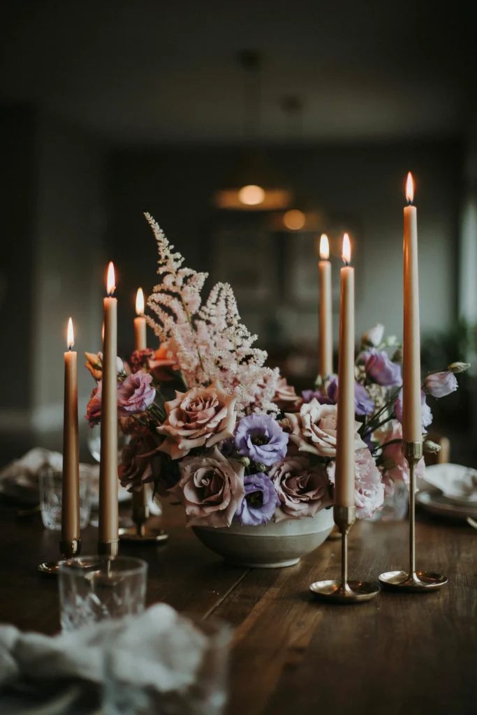
Mauve florals in candlelight are something to see. The warm amber glow of the candles deepens the mauve almost to plum at the edges of each bloom, then lifts it back toward a soft lilac-pink at the centers. The result is a centerpiece that genuinely changes as the evening light shifts — which is not something you can say about florals under ceiling lights.
Why You’ll Love It
Mauve is the most sophisticated pink for evening receptions. It photographs with depth and complexity that paler pinks can’t achieve, and it layers beautifully with champagne, bronze, and warm neutral linens for a look that feels genuinely luxurious without requiring a luxury floral budget.
Styling Tips
Ask your florist for amnesia roses specifically — they’re a naturally muted, grayish-mauve that’s significantly different from a standard pink rose and creates the complex tonal effect this palette depends on. Pair with rose gold candle holders for a warm metallic accent that bridges the gap between the mauve florals and any gold flatware or decor.
16. Rose Gold Champagne Coupe Tower
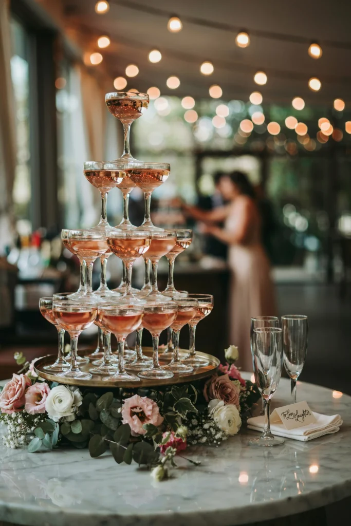
A champagne coupe tower brings a 1920s glamour that contemporary tall flutes simply can’t match — and rose-tinted champagne (or a rosé) in those wide, shallow bowls creates a visual moment that guests will remember and photograph. The coupe shape is an aesthetic choice as much as a practical one, and it’s the right choice for this palette.
Best For
Brides who want the reception to feel like a genuine celebration the moment guests walk in. A champagne tower as a focal point at the bar area creates immediate energy and gives guests something to look at and talk about before the dancing starts.
Pair It With
A garland of blush and mauve flowers draped around the base of the tower, low ambient lighting, and a bar cart styled in rose gold metallic accessories. The full effect is part Great Gatsby, part modern editorial — and entirely beautiful.
17. Rose Gold Stationery Suite
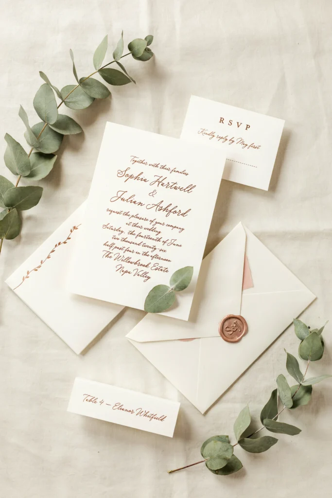
Rose gold foil printing is one of the most effective ways to add luxury to your stationery without a full custom calligraphy budget. The foil catches light at every angle — it reads metallic in direct light and nearly cream in shadow, which means your invitation looks different and beautiful in any lighting condition your guests open it in.
Why It Stands Out
Rose gold sits perfectly between the warmth of gold and the pink of your wedding palette — it’s a metallic that belongs in the color scheme rather than standing outside it as a neutral accent. Pairing it with a dusty pink wax seal (achievable with any standard wax seal kit) turns the envelope into something guests will want to keep.
Styling Tips
Order a sample print before your full run — rose gold foil color varies significantly between printers and the swatch you see on screen is rarely what arrives in the envelope. Request a physical sample on your actual chosen card stock before approving the full order.
18. Mauve and Champagne Table Setting
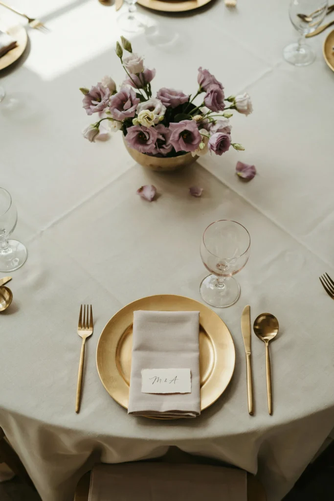
Champagne linen as a base is softer and warmer than white, and that warmth is exactly what makes mauve florals look intentional rather than accidental against it. The mauve cloth napkin at each setting bridges the table color to the centerpiece floral, and a blush goblet at each place adds the pink element without overwhelming the muted sophistication of the overall palette.
Best For
Autumn and winter weddings in warm-toned venues — think exposed brick, rich wood floors, and amber lighting. The champagne-mauve combination is particularly beautiful under warm lighting conditions and in evening receptions where candlelight does the work.
Styling Tips
Use blush cloth napkins folded simply at each place rather than elaborately — over-folded napkins in a rich palette feel formal in a way that works against the warmth you’re creating. A simple rectangle or roll is enough.
Budget-Friendly & DIY Pink Wedding Ideas
19. DIY Pink Flower Crown for the Bride
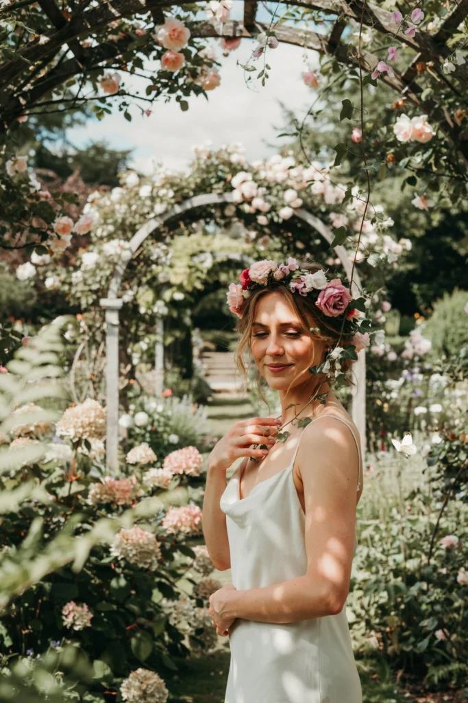
A flower crown made of mixed pink garden roses and sweet peas has a romantic, slightly undone quality that no other bridal accessory creates. The crown doesn’t need to be tight or perfectly circular — the looseness is part of the aesthetic, and sprigs of greenery trailing past the ear add a naturalness that frames the face beautifully in portraits.
Budget Tip
Flower crowns use significantly fewer blooms than a full bouquet and can be made at home the morning of the wedding with fresh flowers from a local florist or farmers market. Total material cost for a beautiful crown is often under $40. The internet is full of step-by-step tutorials and the technique is genuinely learnable in one practice session.
Best For
Outdoor garden weddings, garden wedding styles, and brides who want a more relaxed and bohemian bridal look. Also beautiful for flower girl headpieces that coordinate with the bridal crown for a sweet visual connection between bride and her flower girls.
20. Carnation Centerpieces in Pink Shades
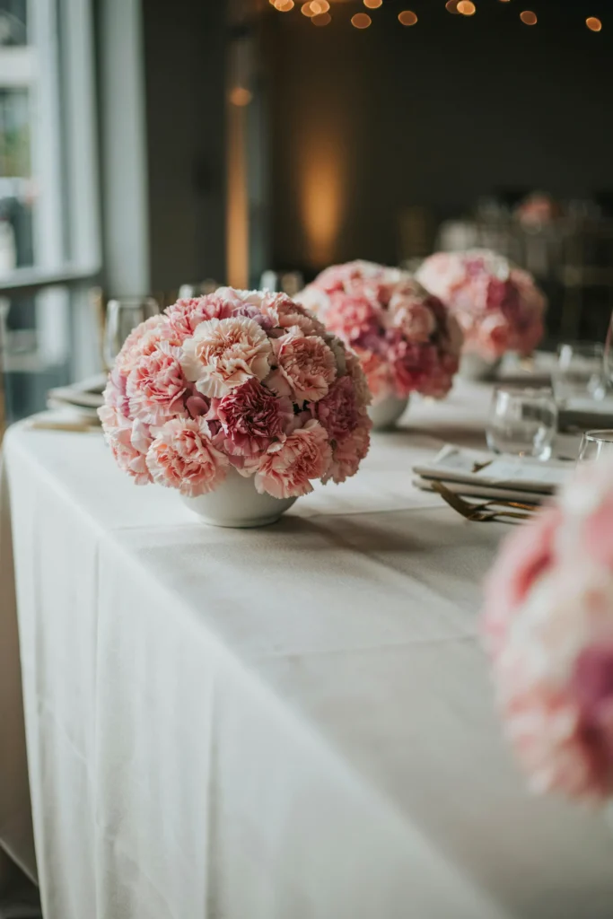
Carnations have had a reputation problem for decades, and that reputation is entirely undeserved. Tightly packed carnations in a single-flower centerpiece create a graphic, lush arrangement that photographs like a dream and costs a fraction of what the same volume in roses would run. The trick is committing fully — no mixed flowers, no greenery, just carnations from rim to rim of the vessel.
Budget Tip
Per stem, carnations are among the least expensive wedding flowers available while also being among the longest-lasting. A centerpiece that might cost $120 in garden roses could be achieved for $30–$40 in carnations, with zero loss in visual impact when arranged tightly. If your floral budget is tight, this is the single most effective swap you can make.
Styling Tips
Use multiple shades of pink carnation in one arrangement — blush at the center graduating to mid-pink at the edges — for an ombre effect that looks custom and intentional. Short, wide ceramic or terracotta vessels suit this arrangement better than tall vases. Label them as “garden roses” on your wedding day and no guest will ever know the difference.
21. DIY Pink Paper Stationery Details
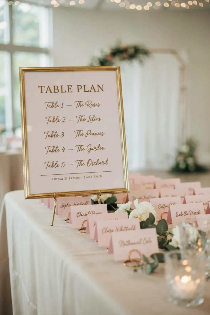
Pink card stock — available in every shade from blush to magenta at any craft or paper supply store — is one of the most accessible ways to add coordinated color to your stationery details without paying a designer. Escort cards, place cards, table numbers, and menus all printed or handwritten on matching pink card stock create genuine visual cohesion for a total budget that’s often under $30 for a 100-guest wedding.
Why You’ll Love It
The uniformity of matching paper tones is actually easier to achieve with a consistent card stock than with custom printing, and the monochromatic look is legitimately on-trend. Guests notice coordinated stationery details more than they notice expensive ones.
Styling Tips
Use a gold calligraphy pen for handwritten details — the combination of pink card and gold ink is a classic for a reason. If handwriting isn’t your strength, a simple gold foil label printer produces clean, professional-looking results at home. Add a blush silk ribbon tie through a hole-punched corner of each escort card for a finished look that takes seconds per card.
22. Pink Spring Wedding Favors
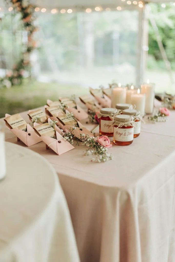
Wedding favors are the element guests most frequently forget — which means a favor that’s genuinely useful or charming is all the more memorable. Seed packets in custom pink envelopes, small jars of locally sourced honey with a pink label, or a mini candle in a rose scent all say “we thought about this” without saying “we spent a lot.”
Budget Tip
Favors consistently show the least return on wedding budget investment — the majority are left on the table or forgotten in bags. If your budget is tight, redirect favor money to food, florals, or music where guests will feel it. If you do want favors, edible options (mini honey, jam, or a cookie) have a take-home rate significantly higher than decorative items.
Best For
Spring and early summer weddings where botanical and garden-themed favors feel seasonally aligned. For more ideas that fit a spring theme, spring wedding favor ideas is a full resource worth exploring.
Seasonal Pink Wedding Ideas
23. Spring Garden Wedding in Blush and White
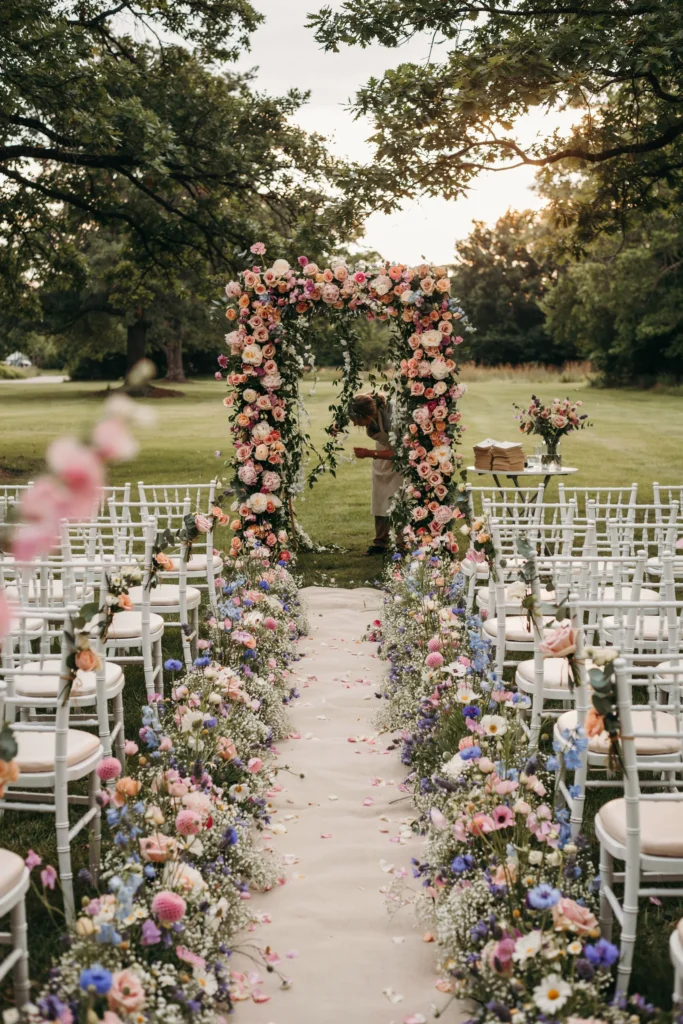
A garden wedding in full bloom is the natural habitat for blush. The existing colors of a garden in late spring — the ivory of white roses, the green of hedges, the lavender of flowering shrubs — create a ready-made palette that blush simply belongs in. No venue decoration required beyond a well-placed arch and some chair styling.
Best For
Brides who want their wedding to feel like a natural extension of a beautiful outdoor space rather than a decorated room. Garden wedding venues often require less additional decor investment precisely because the setting does the work. For full inspiration on this style, garden wedding ideas covers the full scope of what’s possible.
Styling Tips
Work with what’s already blooming at your venue’s peak season rather than forcing out-of-season flowers. A good florist can build your palette around what will be naturally available, which reduces cost and creates a look that’s seasonally perfect rather than styled against its environment.
24. Summer Hot Pink Outdoor Celebration
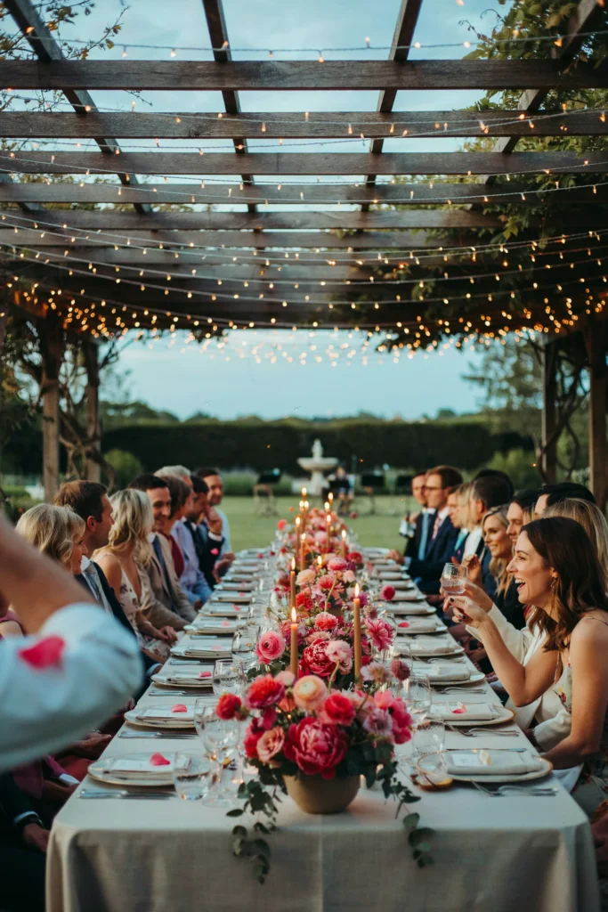
Summer light is hot pink’s natural partner. The long golden hour of a summer evening turns saturated pink flowers into something that practically glows — an outdoor reception in this palette at the golden hour is one of the most photographically dramatic settings possible without any additional lighting required.
Why It Stands Out
Most pink weddings default to spring settings and soft colors. A summer hot pink wedding takes the season’s abundance of light and warmth and leans fully into it — the result feels festive, alive, and genuinely different from the pastel-spring wedding aesthetic that dominates most wedding inspiration.
Styling Tips
Timing matters more than any other styling decision for an outdoor summer reception. Schedule the ceremony to finish at golden hour so the reception begins in that warm light. Position the main table where the sunset will hit it directly for the first hour of dining.
25. Autumn Dusty Rose Wedding with Warm Tones
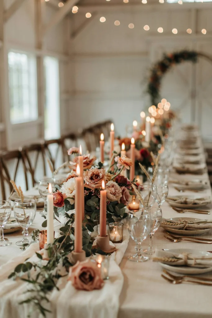
Dusty rose in autumn is a revelation for brides who worry pink won’t work outside spring. The muted, slightly greyed quality of dusty rose reads as a natural extension of the fall color palette — it sits comfortably beside terracotta, olive, and deep burgundy in a way that baby pink or blush simply cannot. The result is a wedding that feels richly autumnal rather than pinkly incongruous.
Pair It With
Terracotta taper candles, deep green olive branches, and linen napkins in a warm oatmeal tone. Avoid white — it introduces a freshness that fights the warm, earthy quality you’re going for. Champagne or greige reads much better as the neutral in this palette.
Good to Know
Autumn wedding florals are significantly more abundant than most brides realize — dahlias, cosmos, and garden roses all peak in late summer through fall and are often less expensive in autumn than in spring because of local availability. Ask your florist what’s peaking locally on your date for the best combination of beauty and value.
26. Winter Mauve Wedding with Candlelight
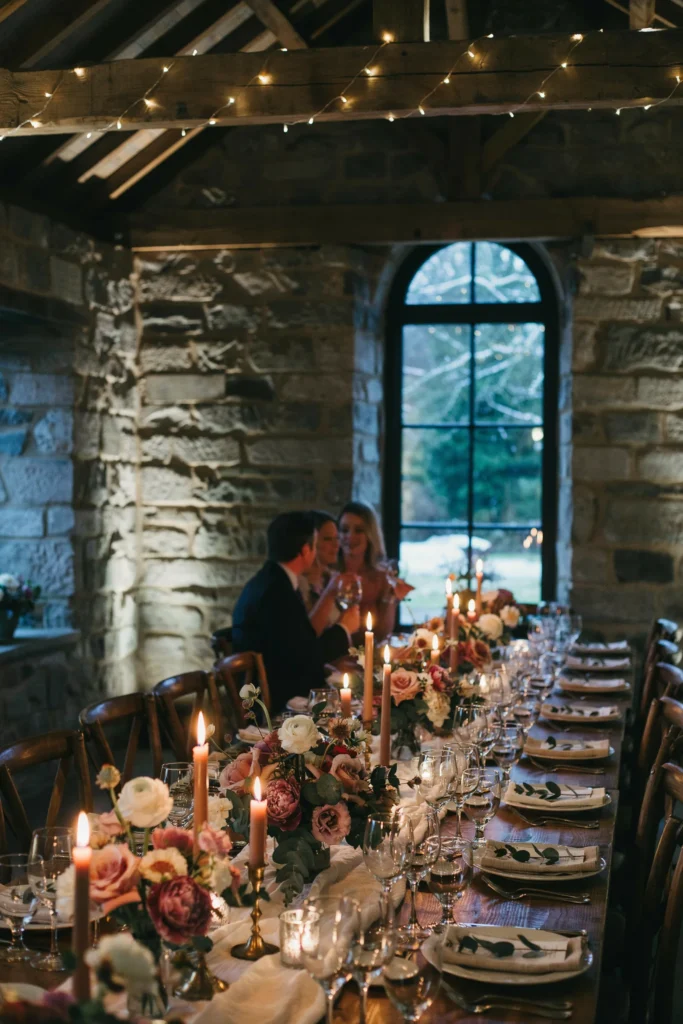
A mauve wedding in winter is a candlelit celebration waiting to happen. The richness of mauve against warm amber candlelight creates the most intimate, atmospheric reception setting possible — every photo looks like it was taken in a painting. The stone walls, the candles, the flowers in that particular grey-pink — it’s a combination that photographs with extraordinary depth.
Why You’ll Love It
Winter weddings often battle the perception that they’ll look cold or bare. Mauve and candlelight is the complete antidote — it creates warmth, intimacy, and visual richness that outdoor spring or summer weddings with natural light can’t replicate.
Styling Tips
Multiply your candles beyond what feels like enough. For a candlelit winter reception to look the way it does in photos, you need approximately three times more candles than your instinct suggests. Use a mix of rose gold candle holders at varying heights — the layered glow effect is what makes the atmosphere feel rich rather than dark.
Personal Touches & Detail Ideas
27. Pink Shade Pantone Swatch Save-the-Dates
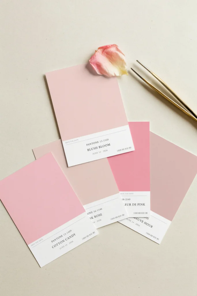
A save-the-date designed to look like a Pantone color swatch is both a design-forward stationery choice and a practical commitment to your signature shade — it tells guests “this wedding has a color story” before they’ve RSVP’d. The simplicity of the format means even a home printer can produce a clean result, and the concept photographs beautifully as a detail shot.
Why It Stands Out
The Pantone card format has genuine cultural cachet — it signals design awareness without being pretentious, and it gives guests a talking point. It also works beautifully for couples who want to communicate their color palette to bridesmaids and vendors before any other planning materials are finalized. Use wedding color swatches to confirm your exact shade before committing it to print.
Best For
Design-aware couples and brides who want their wedding stationery suite to feel cohesive from the very first piece guests receive. This concept is equally strong for a blush wedding, a hot pink wedding, or any shade in between — the Pantone format is shade-agnostic and always looks intentional.
28. His Pink Tie Moment: Groom Accessories in Blush
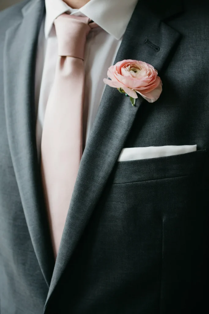
A blush silk tie paired with a classic dark or grey suit is the most elegant way to connect the groom to the wedding’s pink palette without the look becoming a costume. The tie grounds him in the color story; the suit grounds him in formality. The balance is exactly right.
Best For
Grooms who want to participate visually in the palette without wearing a colored suit — which is a strong look but not for everyone. The tie approach is universally flattering and works across every wedding formality level from semi-formal to black tie.
Styling Tips
Match the tie shade precisely to the bridesmaids’ dresses rather than approximately — the cohesion shows in photos and the precision signals that the look was designed, not assembled. A blush boutonnière flower in a complementary bloom (ranunculus, a single garden rose bud, or sweet peas) ties the groom’s look to the floral palette without a full corsage.
29. Pink Wedding Fairy Lights Installation
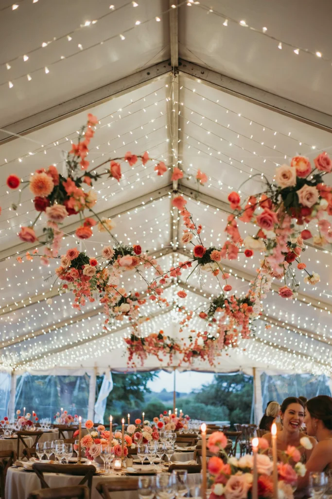
A fairy light ceiling over a reception space transforms the entire venue from “a room” into “a place.” The warm white light combined with pink floral garlands woven between the strings creates something that looks significantly more expensive and theatrical than the cost of the components suggests — particularly in outdoor or semi-outdoor tented venues where the night sky adds to the effect.
Why You’ll Love It
This installation photographs from every angle. From the dance floor looking up, from the entrance looking across, from the head table looking out — every photo taken under this ceiling has the same magical quality. It also eliminates the need for extensive table lighting because the ambient light from above handles the room.
Styling Tips
For the fairy garden wedding aesthetic specifically, this light installation paired with lush greenery walls and minimal structured decor is the full look. Keep tables simpler than you think you need — the ceiling carries the atmosphere and competing tablescapes will fight it rather than complement it.
30. Pink and Gold Wedding Signage

A welcome sign in a gold-framed mirror with pink floral styling at the base is the kind of reception entrance detail that guests stop and photograph before they even look for their seats. The mirror frame adds depth — you see both the sign and the reflection of the space behind you — and the pink florals at the base connect the sign to the day’s palette without requiring any redesign of the sign itself.
Worth the Splurge?
Mirror welcome signs are widely available for rental through wedding stylists and décor rental companies — the rental cost is typically $80–$150 and is almost always worth it over purchasing a sign that serves a one-time purpose. The floral arrangement at the base can come from your florist’s secondary arrangements, which reduces additional cost.
Styling Tips
Place the welcome sign where guests naturally slow down — not at the very entrance where they’re still moving, but just inside the first turn or threshold where they pause and orient themselves. This is the moment they’ll stop and photograph it. Tie a length of blush silk ribbon around one corner of the frame for a soft finishing detail that takes thirty seconds and photographs beautifully.
Common Mistakes to Avoid in a Pink Wedding
- Mixing warm and cool pinks: Coral-pink and dusty rose have opposing undertones and will clash noticeably in photos. Choose one temperature — warm or cool — and hold every pink element to it.
- Using the same pink shade everywhere: An all-pink wedding reads as a theme rather than a palette. Anchor one or two key elements in your chosen shade and use ivory, white, green, or a metallic as the dominant neutral throughout.
- Skipping the physical swatch test: Pink looks different on screens, in print, in fabric, and on flowers. Before finalizing any major element — dresses, linens, florals — get physical samples side by side in your actual venue’s lighting conditions.
- Ignoring photography considerations: Baby pink and very pale blush can wash out in bright outdoor midday light. Confirm your photo schedule accounts for the lighting conditions at your venue at the exact time of your ceremony.
- Forcing pink into every detail: Pink stationery, pink cake, pink flowers, pink linen, pink bridesmaids, pink favors, and pink shoes is too much. Choose three to four elements to carry the color — let the rest breathe in neutrals.
Frequently Asked Questions
What is the most popular shade of pink for weddings right now?
Blush remains the most consistently popular wedding pink — it’s soft enough to work with almost any venue and neutral enough to pair with a wide range of accent colors. Dusty rose has maintained strong popularity for fall and winter weddings, and hot pink is experiencing a genuine comeback for brides who want a bolder, more statement-driven palette.
Can I do a pink wedding in fall or winter?
Absolutely. Dusty rose, mauve, and deep rose are ideally suited for fall and winter. These shades are warmer and richer than spring pinks, and they pair naturally with the terracotta, burgundy, and deep green tones common in autumn and winter wedding decor. Avoid baby pink and blush in cooler months — they look seasonally mismatched without the soft light of spring and summer to support them.
What colors go best with blush pink for a wedding?
Blush pairs beautifully with ivory, white, gold, sage green, and champagne. For a richer look, try blush with dusty rose and mauve for a tonal palette. For something fresh and botanical, blush against deep green foliage with touches of ivory is a classic that never fails in photos.
How do I keep a pink wedding from looking childish or immature?
Choose a more complex shade — dusty rose, mauve, or deep rose rather than baby pink or candy pink. Pair your chosen pink with sophisticated neutrals (ivory, champagne, greige) rather than white and primary colors. Keep the saturation of pink highest in your florals and lowest in large fabric elements like table linens and bridesmaid dresses.
Is hot pink appropriate for a wedding?
Yes, when used with intention. Hot pink as the dominant floral color against white linens and simple neutrals creates a confident, contemporary wedding aesthetic that’s genuinely striking. Where brides go wrong is spreading hot pink across every element — dresses, linens, cake, and florals — which tips from bold into overwhelming. Use it as your statement color in two or three key elements and let everything else rest.
What pink wedding flowers are available year-round?
Standard roses, carnations, lisianthus, and anthurium are available throughout the year in a wide range of pink shades. Peonies are a spring-summer flower and are significantly more expensive out of season. Dahlias peak from late summer through fall. If you’re marrying outside the typical spring-summer window, discuss seasonal flower availability with your florist before committing to specific blooms.
More Inspiration You’ll Love
- Garden Wedding Ideas: Beautiful Inspiration for an Outdoor Celebration
- Fairy Garden Wedding Ideas That Are Pure Magic
- Fairy Wedding Cake Designs That Look Like They Came from a Fairytale
- Bright Magenta Wedding Cake Ideas for Bold Brides
- Spring Wedding Favor Ideas Your Guests Will Actually Keep
- Spring Wedding Color Palettes That Are Fresh, Beautiful, and On-Trend


![A softly lit barn reception at golden hour, string lights overhead, a long wood table set with terracotta linens and a pampas grass runner, guests in flannel and velvet visible in the blurred background.]](https://luxelocksstudio.com/wp-content/uploads/2025/06/rustic-fall-wedding-1-768x1152.webp)