Fresh Summer Wedding Color Ideas
Summer weddings invite color in a way no other season does. With longer days, open-air venues, and natural light doing half the styling work, the right palette can instantly set the mood—romantic, modern, playful, or quietly elegant.
The key is choosing combinations that feel intentional, photograph beautifully, and carry through every detail, from florals and linens to attire and paper goods.
Ahead, you’ll find 20 fresh summer wedding color combinations that strike the perfect balance between trend-forward and timeless, each designed to work seamlessly across your ceremony and reception without overwhelming the space.
This post may contain affiliate links, please refer to privacy policy for more information.
Summer Wedding Colors You’ll Love
Soft Peach and Warm Ivory


Soft peach and warm ivory create a romantic summer palette that feels light, polished, and timeless. For bouquets, blend ivory roses or ranunculus with peach garden roses for a soft, sun-washed look. At the reception, warm ivory table linens keep things elegant, while peach accents add seasonal warmth. A simple way to carry the color through is with peach satin ribbon wrapped around bouquets or used on chairs and signage.
Dusty Blue and Eucalyptus Green

Dusty blue paired with eucalyptus green feels calm, refined, and effortlessly summery. Floral arrangements look beautiful with white blooms, soft blue accents, and loose eucalyptus for movement and texture. Neutral table settings allow the greenery to shine, especially when layered with eucalyptus garlands running down long tables. This palette works equally well for garden, coastal, and classic indoor venues.
Butter Yellow and Crisp White


Butter yellow and crisp white bring a cheerful yet elegant energy to a summer wedding. White florals create a clean foundation, while pale yellow blooms add warmth without overwhelming the palette. Reception tables feel fresh with white linens accented by soft yellow details, such as napkins or florals arranged in clear bud vases. This combination is especially striking in outdoor or daytime settings.
Terracotta and Soft Blush


Terracotta and soft blush balance earthy warmth with romantic softness. Blush roses and neutral blooms soften the richness of terracotta tones, creating a grounded yet inviting look. Use terracotta elements sparingly—such as pottery-style vessels or tabletop accents—to anchor the design. Incorporating terracotta vases adds texture while keeping the palette intentional and cohesive.
Lavender and Cool Gray


Lavender and cool gray offer a modern, understated take on summer color. Lavender florals introduce gentle color, while gray linens or décor elements keep the look sleek and balanced. This palette works beautifully in minimalist or formal spaces where subtle contrast is preferred. Small details, like lavender ribbon on bouquets or stationery, are often enough to make the color combination feel deliberate without overpowering the design.
Sage Green and Champagne


Sage green and champagne create a soft, elevated palette that feels timeless yet perfectly suited to summer. Sage greenery brings a natural, organic element to bouquets and centerpieces, while champagne accents add warmth and subtle shine. Reception tables look especially refined with neutral linens paired with metallic details, such as champagne charger plates. This combination works beautifully for garden venues and elegant indoor spaces alike.
Coral and Sand


Coral and sand offer a relaxed, coastal-inspired look without feeling overly themed. Coral florals provide a vibrant focal point, while sand-toned linens and décor keep the palette grounded. This pairing feels especially at home at beachside or destination weddings, where natural textures enhance the overall design. Adding woven neutral placemats or subtle rattan accents helps reinforce the effortless summer feel.
Sky Blue and Soft Buttercream

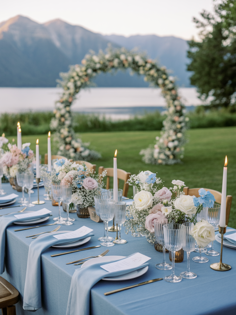
Sky blue and soft buttercream feel light, romantic, and ideal for warm-weather celebrations. Blue accents work beautifully in florals, stationery, or attire, while buttercream tones soften the overall look. For reception styling, neutral linens paired with airy florals and blue glass candle holders create an elegant yet relaxed atmosphere. This palette shines in outdoor ceremonies where natural light enhances its softness.
Rosewood and Pale Pink


Rosewood and pale pink bring depth and warmth to a summer wedding palette without feeling heavy. Pale pink florals lighten the richness of rosewood tones, creating a balanced and romantic aesthetic. This combination works well for evening receptions or formal settings where deeper hues add sophistication. Incorporating rose-toned table runners is an easy way to echo the color story across reception tables.
Mint Green and Pearl White


Mint green and pearl white feel fresh, airy, and subtly vintage. Mint works beautifully in florals or bridesmaid attire, while pearl white keeps the palette refined and cohesive. For table décor, simple white linens paired with soft green accents feel clean and intentional. Small details like pearl charger plates add dimension without distracting from the softness of the overall design.
Sunset Orange and Soft Taupe


Sunset orange paired with soft taupe creates a warm, sophisticated palette that feels especially striking for late-summer celebrations. Orange florals add energy and depth, while taupe tones keep the look grounded and refined. This combination works beautifully for evening receptions, where candlelight enhances the richness of both colors. Incorporating amber glass votive candles is an easy way to echo the warmth without overwhelming the tablescape.
Navy and Soft Peach


Navy and soft peach offer a classic contrast that still feels light enough for summer. Navy anchors the palette through attire or table accents, while peach softens the overall look with a romantic touch. Florals that blend white blooms with peach tones help bridge the gap between bold and delicate. For reception décor, subtle elements like peach cloth napkins add just the right amount of warmth against darker accents.
Lemon and Dusty Blue


Lemon and dusty blue feel playful yet balanced, making this pairing ideal for couples who want color without excess. Soft blue tones keep the palette calm, while lemon adds brightness and personality. This combination works especially well in outdoor venues where natural light enhances both shades. A simple way to introduce the color story is through blue patterned table runners paired with fresh yellow florals.
Warm Neutrals and Olive Green


Warm neutrals layered with olive green create an understated, organic summer palette. Olive greenery adds richness and texture, while neutral tones keep the overall look relaxed and elegant. This combination feels especially appropriate for minimalist or nature-inspired weddings. Carry the palette through reception tables with neutral linens and olive green napkins for a cohesive, intentional finish.
Lilac and Soft Butter Yellow


Lilac and soft butter yellow strike a romantic yet cheerful balance that feels unmistakably summery. Lilac florals bring a gentle pop of color, while pale yellow keeps the palette light and inviting. This pairing works beautifully for daytime ceremonies and garden receptions. Small styling touches, such as pastel ribbon bundles used on bouquets or signage, help tie the colors together without overpowering the design.
Blush and Warm Gray


Blush and warm gray offer a modern neutral palette that still feels undeniably romantic. Blush florals soften the coolness of gray, creating a balanced look that works well in both indoor and outdoor settings. Warm gray linens or suits provide a polished foundation, while blush accents keep the design from feeling too stark. Thoughtful details, such as blush glass votive candles, add warmth without disrupting the clean aesthetic.
Aqua and White


Aqua and white feel crisp, refreshing, and perfectly suited for summer weddings in warm climates. White florals and linens keep the palette clean, while aqua accents introduce a subtle pop of color that feels light and breezy. This combination shines in outdoor venues, where sunlight enhances its clarity. Incorporating aqua glass vases into table décor is an easy way to reinforce the palette without overpowering the space.
Champagne and Soft Peach


Champagne and soft peach create a refined palette that feels elegant without being overly formal. Peach florals bring warmth and romance, while champagne tones add understated glamour through metallic accents and glassware. This pairing works especially well for evening receptions, where candlelight enhances its softness. Details like champagne metallic charger plates help elevate the tablescape while keeping the overall look cohesive.
Choosing your summer wedding colors is less about following trends and more about creating a palette that feels cohesive from start to finish. Whether you’re drawn to soft pastels, warm neutrals, or a single statement hue, the most memorable weddings are the ones where color is used with intention. Save the combinations that resonate most, then let them guide your florals, décor, and styling decisions throughout the day for a celebration that feels effortless, polished, and unmistakably yours.
Other Posts You Might Like: