20 Raspberry Wedding Color Scheme Ideas for a Bold, Romantic Palette
Quick Answer: Raspberry is a rich, romantic wedding color that pairs beautifully with blush and gold for timeless elegance, navy or charcoal for modern drama, sage and terracotta for garden warmth, or plum and emerald for jewel-toned luxury. These 20 palettes show exactly how to build your scheme.
Raspberry sits in that sweet spot between red and pink — bold enough to anchor a whole reception, soft enough to still feel romantic in photos. It’s the color couples reach for when blush feels too quiet and true red feels too matched-to-Christmas.
The hard part isn’t loving raspberry. It’s figuring out what to put next to it so the whole room feels intentional instead of random. That’s what this gallery solves — twenty real palette combinations, sorted by mood, so you can see exactly how raspberry behaves next to gold, navy, sage, or plum before you commit to anything.
This post may contain affiliate links, please refer to privacy policy for more information.
Romantic & Timeless
1. Raspberry, Blush, and Gold

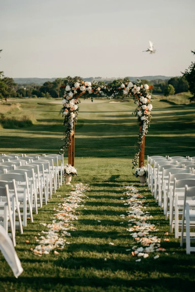
This is the pairing that never dates — raspberry does the heavy lifting as the deep, saturated accent while blush keeps everything soft around it, and gold ties the two together so nothing feels like it’s competing. It reads formal without ever tipping into stiff.
Why You’ll Love It
It’s the safest raspberry combination for readers who want boldness without risk — every element here has been a wedding staple for a reason.
Styling Tips
Keep blush as the majority color and let raspberry appear only in the florals and a few accent pieces, like napkin ties or a single statement bloom per centerpiece.
2. Raspberry, Ivory, and Champagne

Swap blush for ivory and this palette instantly reads more formal — think ballroom over garden party. The champagne undertone keeps it warm instead of stark, so the raspberry still feels like the star rather than a jarring pop of color against pure white.
Best For
Black-tie receptions, hotel ballrooms, and couples who want raspberry to feel elevated rather than playful.
Good to Know
True ivory and pure white don’t match — confirm your linens and stationery are working from the same warm-white family before you order anything.
8. Raspberry, Eucalyptus, and Rose Gold
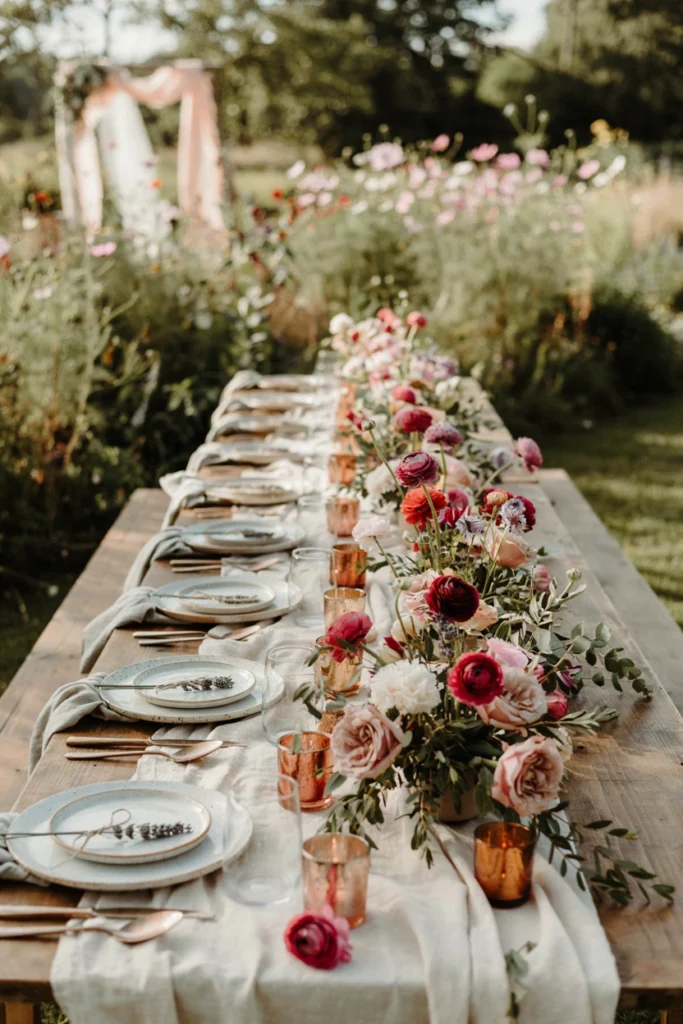
Trading gold for rose gold and adding silvery eucalyptus gives this palette a softer, more contemporary feel than the classic blush-and-gold pairing. It’s romantic, but it photographs younger — this is the version you’ll see at garden weddings more than ballrooms.
Why It Stands Out
Rose gold is warm enough to sit next to raspberry without clashing, unlike cooler silver, which can make raspberry look slightly muddy in photos.
Pair It With
Ask your florist to work eucalyptus into the bridal bouquet too, so the greenery carries from the ceremony straight through to the tables.
17. Raspberry, Blush, and Sage

This is the softer, more garden-leaning cousin of the raspberry-and-blush classic — sage replaces gold as the connecting note, which trades polish for warmth. It’s the palette that feels like it was picked from an actual garden rather than a swatch book.
Why You’ll Love It
Sage is one of the most forgiving greens to work with — it looks intentional next to nearly any raspberry shade, from cool magenta-leaning tones to warmer brick-adjacent ones.
Styling Tips
Use sage-colored ribbon or bud vases as the connective tissue between raspberry blooms so the palette reads cohesive even in loose, unstructured arrangements.
Ideas for Every Budget
Raspberry itself doesn’t have to be expensive — the cost climbs or falls based on what you pair it with. Here’s where to spend and where to save.
| Budget Level | What to Prioritize | What to Skip |
|---|---|---|
| Accessible ($) | Raspberry and sage or blush, mason jar or bud vase arrangements, ribbon accents | Full florist installations, custom velvet linens |
| Mid-range ($$) | Garland runners, rose gold or gold flatware rental, mixed candle heights | Fully custom stationery suites, imported blooms |
| Luxury ($$$) | Velvet linens, jewel-tone florals (raspberry, plum, emerald), full florist design | N/A — this is where the drama pays off in photos |
Modern & Moody
3. Raspberry, Navy, and Cream
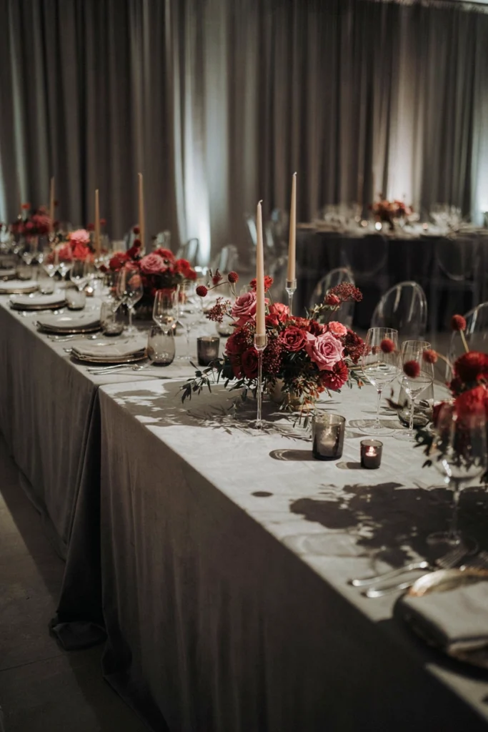
Navy gives raspberry something to push against — where blush softens it, navy sharpens it, turning the whole palette formal and a little unexpected. Cream keeps the darkness from feeling heavy on a daytime table.
Best For
Fall and winter weddings, or couples who want a formal palette that isn’t the usual black-and-white or burgundy-and-gold combination.
Good to Know
Order fabric swatches before committing — navy varies enormously by vendor, and a navy that’s too black won’t read as navy against raspberry in photos.
4. Raspberry, Charcoal, and Silver
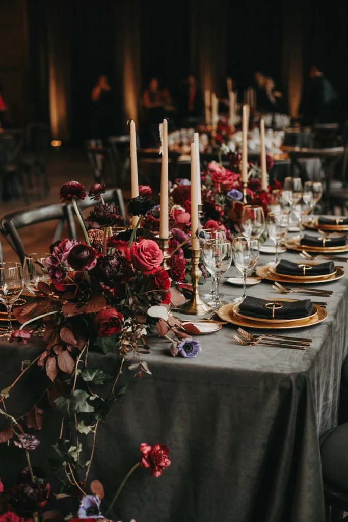
This is raspberry at its most contemporary — charcoal strips away any softness, leaving the raspberry to read as a bold, almost architectural pop of color rather than a romantic accent. Silver keeps it cool instead of warm.
Why It Stands Out
Most raspberry palettes lean warm and romantic; this one goes the opposite direction, which makes it genuinely rare on wedding boards.
Styling Tips
Keep florals dense and dark — mix raspberry with deep burgundy or near-black blooms so nothing looks accidental against the charcoal base.
5. Raspberry, Black, and Gold
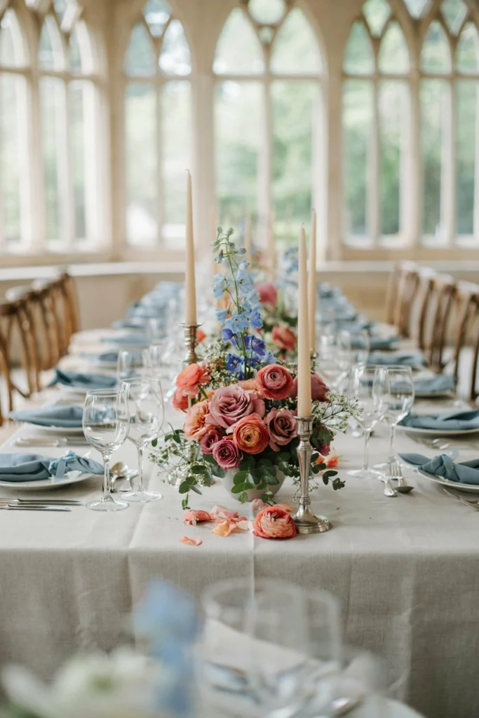
Black does what no other color on this list can — it makes raspberry look genuinely luxurious, almost like velvet. This is the palette for an evening reception where the lighting will be low and the candles will be doing most of the visual work.
Worth the Splurge?
Yes — black linens and gold flatware rentals cost more than standard white, but they transform how every photo under evening lighting reads.
Pair It With
Add a raspberry velvet ribbon to the bridal bouquet to echo the tablescape’s richness in the ceremony photos too.
11. Raspberry, Dusty Blue, and Silver
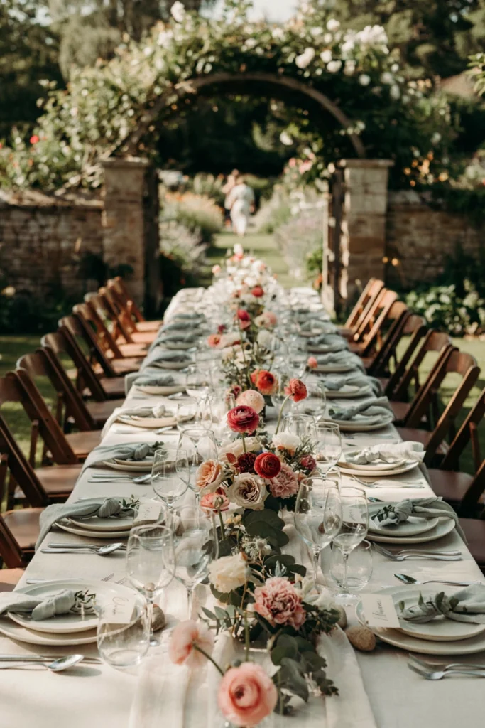
This is the pairing nobody expects — dusty blue is cool where raspberry is warm, and the contrast is what makes it memorable instead of matchy. It’s an unusual enough combination that guests will actually notice the color story.
Why You’ll Love It
It gives couples a way to use raspberry without landing anywhere near the typical blush-and-gold crowd.
Good to Know
Balance is everything here — let raspberry stay dominant and use dusty blue only in accents like ribbon, menu cards, or bridesmaid sashes, or the palette can start to feel cold.
Which Metal Pairs Best with Raspberry?
Metal choice changes the entire mood of a raspberry palette more than almost any other decision. Here’s how each one behaves.
| Metal | Mood | Best For |
|---|---|---|
| Gold | Warm, classic, romantic | Blush or ivory pairings, ballroom formality |
| Rose Gold | Soft, modern, youthful | Garden and eucalyptus pairings |
| Silver | Cool, contemporary, sharp | Navy, charcoal, or dusty blue pairings |
| Copper | Warm, unexpected, earthy | Terracotta and rust-toned autumn pairings |
Garden & Boho
6. Raspberry, Sage, and Cream
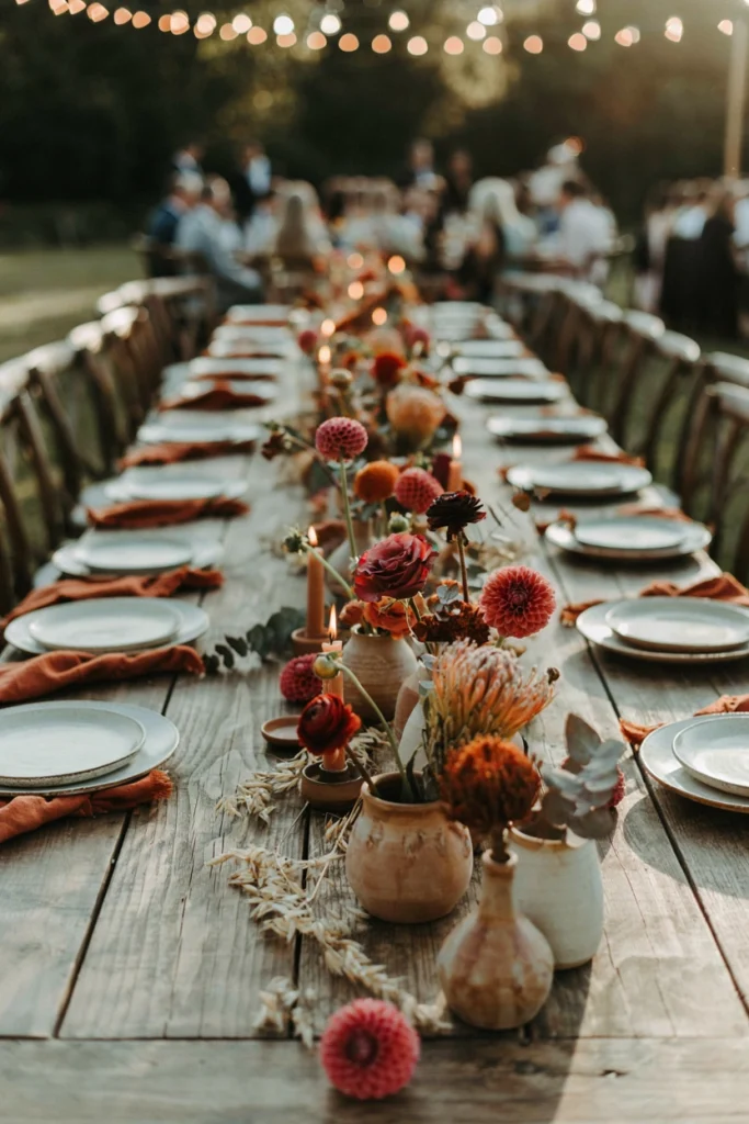
This one leans fully into a garden-party feel — sage softens the intensity of raspberry the same way blush does, but with an earthier, more organic result. It’s the palette for couples who want romance without a single metallic in sight.
Best For
Outdoor daytime receptions, garden venues, and couples who want a palette that photographs naturally in sunlight rather than candlelight.
Styling Tips
Skip vases where possible and let loose greenery trail across the table — the informality is what sells this look.
7. Raspberry, Terracotta, and Rust
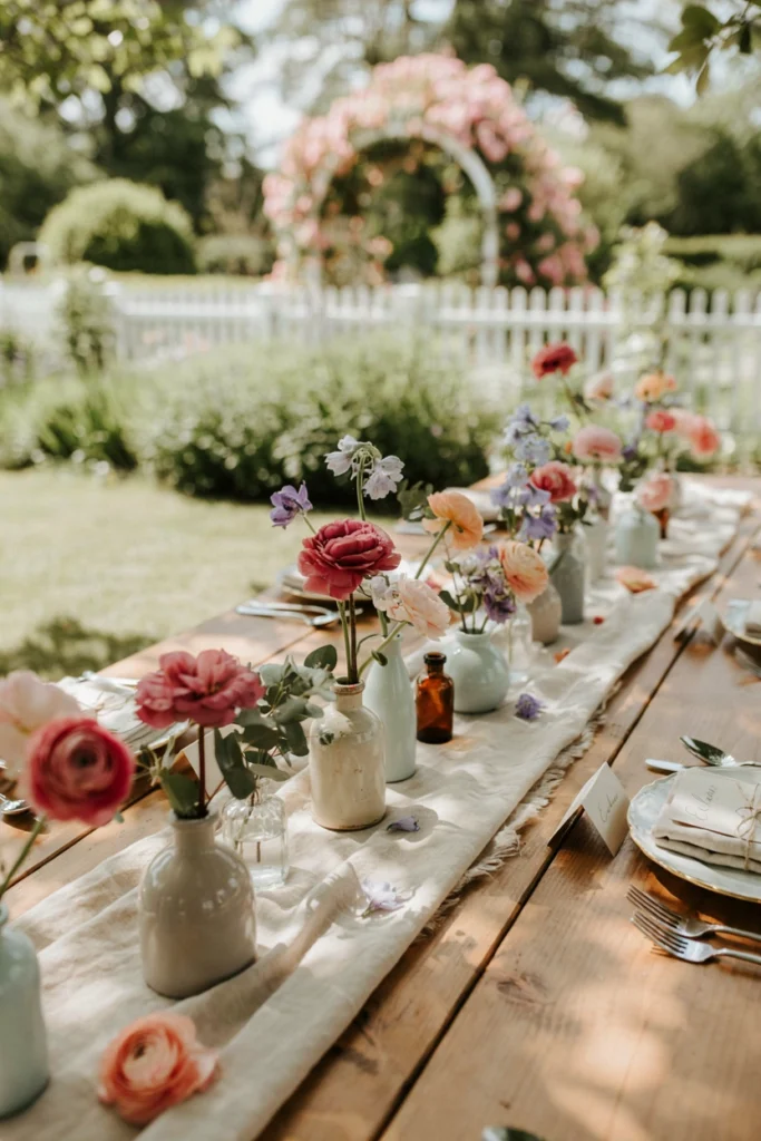
Terracotta and rust push raspberry into full autumn-harvest territory — warm, earthy, and a little sun-baked, like the palette belongs outdoors at golden hour. It’s one of the few raspberry combinations that reads unmistakably seasonal.
Why It Stands Out
Most fall wedding palettes go straight to burgundy and orange; this one keeps raspberry’s brightness in the mix instead of losing it to deeper autumn tones.
Pair It With
Ceramic and stoneware vessels in warm clay tones do more for this palette than glass — the matte texture matches the mood.
13. Raspberry, Lavender, and Sage
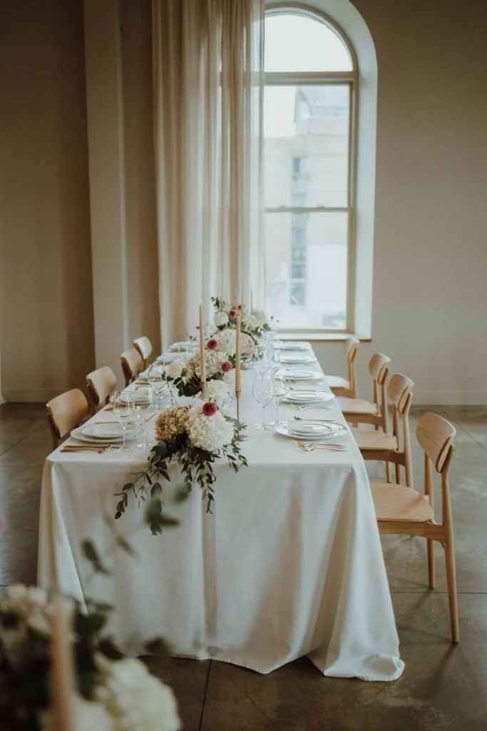
This is the softest, most whimsical entry in the whole roundup — lavender cools raspberry down without fighting it, and sage keeps the combination grounded instead of drifting into full pastel territory. It reads like a cottage garden in early summer.
Why You’ll Love It
Three colors that would each read as “pretty” on their own combine into something genuinely unexpected — most palettes don’t attempt three distinct hues this confidently.
Good to Know
Keep raspberry as the anchor color in the largest blooms, with lavender and sage playing supporting roles in filler flowers and greenery, so the palette doesn’t flatten into an even pastel wash.
14. Raspberry, White, and Greenery
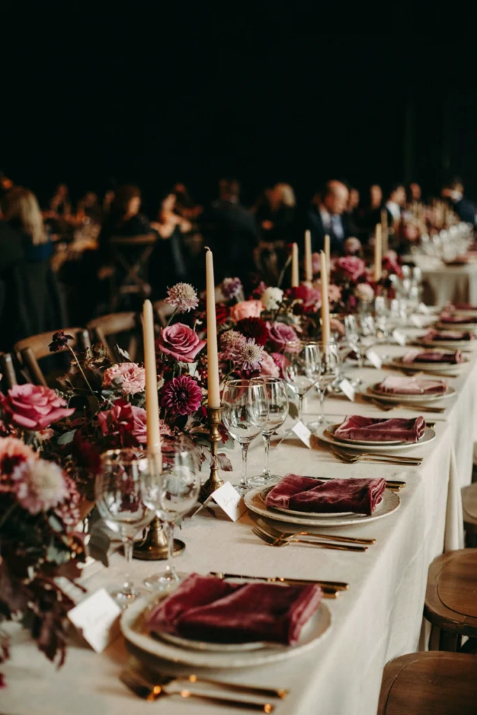
Here raspberry isn’t the star of the palette — it’s the single deliberate accent inside an otherwise white-and-green table. One bold bloom per arrangement does more visual work than a table full of color, and the restraint is what makes it feel expensive.
Best For
Minimalist or micro-weddings, and couples who love raspberry but don’t want a fully saturated room.
Styling Tips
Use raspberry sparingly and consistently — one accent bloom per centerpiece, repeated at every table, reads as intentional rather than random.
Bold & Jewel-Toned
9. Raspberry, Plum, and Gold
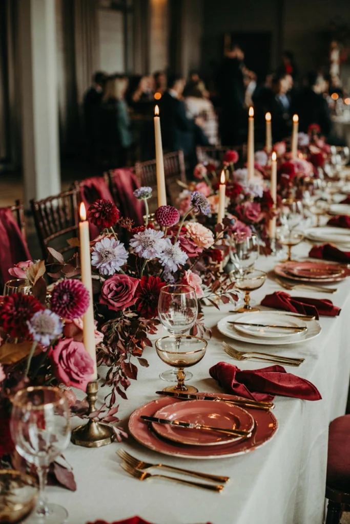
Plum deepens raspberry instead of softening it, creating a tonal, monochromatic-adjacent palette that still has real range between the two shades. Gold keeps it from reading too dark for evening photos.
Why You’ll Love It
Tonal palettes photograph beautifully because nothing fights for attention — every element belongs to the same rich family of color.
Styling Tips
Vary the ratio of raspberry to plum table by table so the reception has depth instead of every table looking identical.
10. Raspberry, Emerald, and Gold
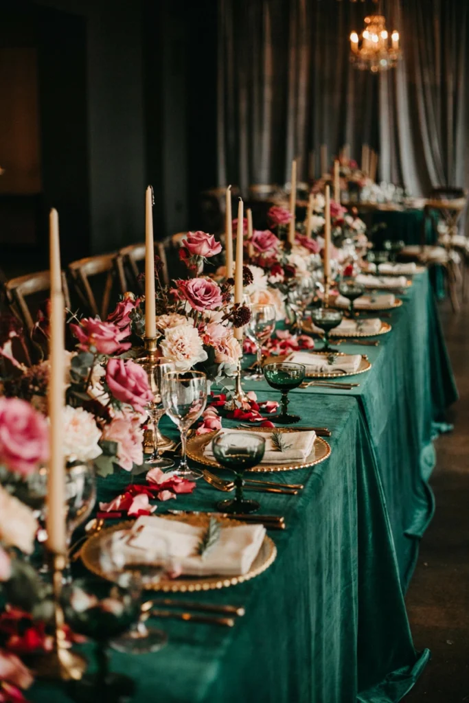
This is the boldest pairing in the roundup — two saturated jewel tones sitting directly next to each other, with gold as the only neutral in the room. It’s dramatic in a way blush-and-gold never will be, and it photographs like something out of an editorial spread.
Worth the Splurge?
Yes — this palette depends on rich, saturated linens and florals to work, so it’s not the place to substitute budget materials.
Good to Know
Give each color its own zone rather than mixing them evenly in every arrangement — one emerald-heavy centerpiece next to one raspberry-heavy centerpiece reads more intentional than blending both into every single piece.
15. Raspberry, Burgundy, and Copper

Burgundy sits just one shade darker than raspberry, which lets this palette build depth without introducing a whole new color family. Copper warms the whole table under low light, making it one of the most flattering combinations for an evening reception.
Best For
Late fall and winter weddings, evening receptions, and couples drawn to a moodier, more luxe color story.
Pair It With
Copper mercury glass votives do double duty here — they add metallic sparkle without competing with the florals for attention.
16. Raspberry, Mustard, and Olive

This is the palette for couples who want fall colors without going full pumpkin-spice — mustard and olive are warm and earthy, but raspberry keeps the whole combination from reading too muted or brown. It’s bold, but grounded.
Why It Stands Out
Three colors that don’t traditionally get paired together create a palette that photographs as genuinely original rather than a variation on a Pinterest trend.
Styling Tips
Lean on dried elements — wheat, dried grasses, dried mustard-toned blooms — to reinforce the harvest mood alongside fresh raspberry stems.
Matching Raspberry to Your Wedding Season
Raspberry genuinely works year-round, but the supporting colors should shift with the season to feel intentional rather than forced.
| Season | Best Pairings | Why It Works |
|---|---|---|
| Spring | Raspberry + lavender + sage | Soft, garden-fresh, plays well with peonies and ranunculus in season |
| Summer | Raspberry + blush + gold | Classic and romantic, holds up beautifully in bright natural light |
| Fall | Raspberry + terracotta + copper | Warm and earthy, matches seasonal foliage and harvest tones |
| Winter | Raspberry + navy or black + gold | Rich and formal, flatters candlelit evening receptions |
Unexpected & Seasonal
12. Raspberry, Peach, and Copper

Peach and raspberry sit close enough on the color wheel to blend seamlessly, but far enough apart that the palette still has real contrast. Copper ties them together with warmth instead of the usual gold or rose gold, giving the whole table a sunset glow.
Why You’ll Love It
It’s warmer and more unexpected than the standard blush-and-gold pairing, without losing any of the romance.
Good to Know
This combination is most flattering in warm, golden-hour lighting — plan outdoor photos accordingly if this is your palette.
18. Raspberry, Gray, and Rose Gold
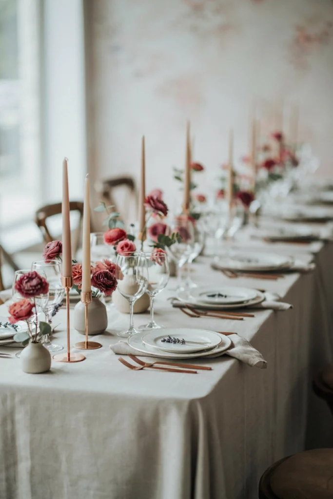
Gray is the most neutral partner raspberry can have — it doesn’t warm or cool the palette, it just steps back and lets the raspberry read clearly. Rose gold adds just enough warmth to keep the whole thing from feeling clinical.
Best For
Modern, minimalist couples who want raspberry as a clear focal color without a competing second hue.
Styling Tips
Use textured gray linens like linen-weave or velvet rather than flat gray fabric — texture keeps the neutral from reading flat next to raspberry’s saturation.
19. Raspberry, Coral, and Gold
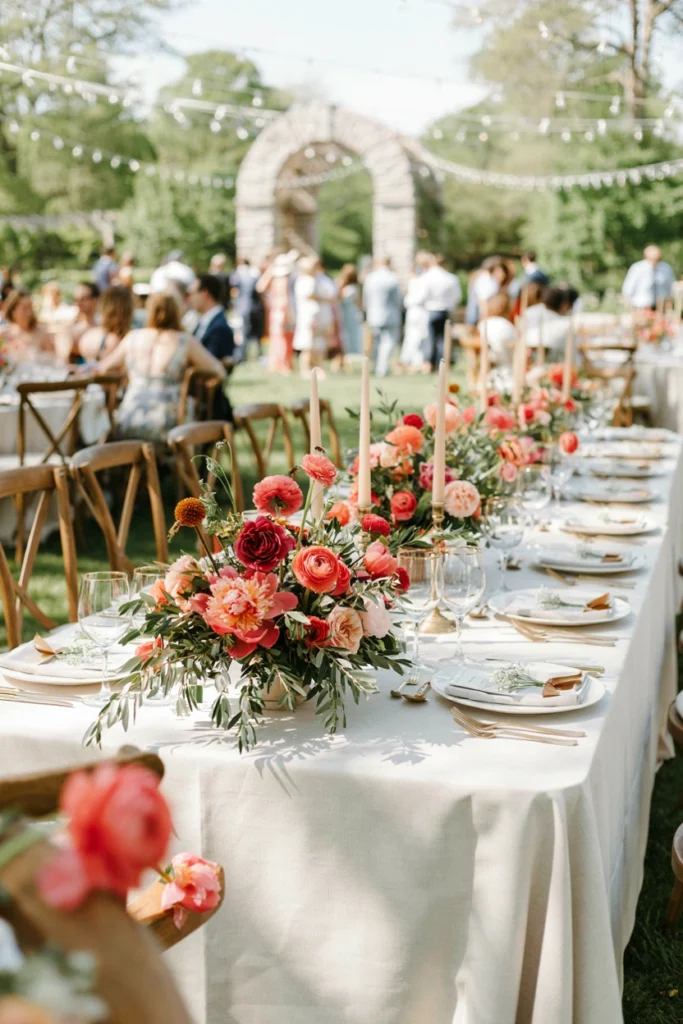
Coral pushes raspberry toward the warmer end of its range, creating a palette with real energy — this is raspberry at its most vibrant rather than its most romantic. It works especially well against greenery-heavy arrangements that let the two pinks pop.
Why It Stands Out
Most raspberry palettes stay muted or jewel-toned; this one is unapologetically bright, which suits a destination or warm-climate wedding perfectly.
Pair It With
Tropical greenery like monstera or palm leaves gives this palette a location-specific feel if you’re planning a beach or garden destination wedding.
20. Raspberry Ombré: Wine to Blush
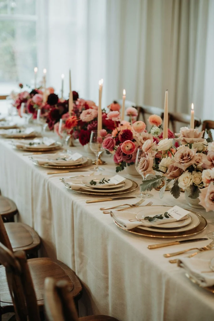
Instead of pairing raspberry with a different color family, this palette stays entirely within raspberry’s own tonal range — deep wine at one end, true raspberry in the middle, pale blush at the other. The gradient effect does the decorating work that a second color usually would.
Why You’ll Love It
Monochromatic palettes are nearly impossible to get wrong — every shade is already designed to work with every other shade in the family.
Styling Tips
Arrange the gradient deliberately along a garland or runner rather than scattering shades randomly, so the ombré effect actually reads in photos.
Common Mistakes to Avoid
- Using too much raspberry: A little goes a long way. Reserve it for 30–40% of the palette and let a neutral or complementary color carry the rest, or the room can feel overwhelming rather than rich.
- Mixing warm and cool metals: Gold and silver rarely sit well side by side in the same tablescape. Pick one metal family and stay consistent across flatware, candle holders, and stationery.
- Ignoring seasonal flower availability: Some raspberry-toned blooms cost significantly more out of season. Ask your florist for in-season alternatives that match the shade before falling in love with a specific stem.
- Choosing colors from a screen instead of in person: Hex codes and fabric swatches don’t always match. Order physical linen and ribbon samples before finalizing a palette.
- Forgetting how lighting changes color: Raspberry looks noticeably different under warm candlelight versus bright daylight. Consider your reception’s lighting before committing to a moody palette like raspberry-and-black.
Frequently Asked Questions
Is raspberry a good wedding color?
Yes — raspberry is romantic, flattering in photos, and versatile enough to work in formal, boho, or modern wedding styles. It pairs well with metallics, neutrals, and other jewel tones alike.
What colors go best with raspberry for a wedding?
Blush, gold, navy, sage, and rose gold are the most popular pairings, but plum, emerald, and terracotta all work beautifully for a bolder, more jewel-toned palette.
Is raspberry a spring, summer, fall, or winter wedding color?
Raspberry works year-round. Pair it with lavender and sage for spring, blush and gold for summer, terracotta and copper for fall, or navy and black for a rich winter palette.
Can raspberry work for a budget wedding?
Yes — raspberry ranunculus and roses are widely available and don’t require rare or imported blooms. Pairing raspberry with sage or blush and using bud vases instead of large arrangements keeps costs down.
Does raspberry look better with gold or silver?
It depends on the mood. Gold and rose gold bring out raspberry’s warmth for a romantic look, while silver creates a cooler, more contemporary contrast that suits navy or charcoal pairings.

![A softly lit barn reception at golden hour, string lights overhead, a long wood table set with terracotta linens and a pampas grass runner, guests in flannel and velvet visible in the blurred background.]](https://luxelocksstudio.com/wp-content/uploads/2025/06/rustic-fall-wedding-1-768x1152.webp)