There’s something magical about spring weddings. The air feels lighter, the gardens come alive, and every shade seems to glow a little softer under the sun. It’s the season where romance naturally blooms — and where your wedding colors can tell a story as fresh as the season itself.
I still remember walking into a spring garden ceremony framed by tulips and wisteria. The colors were so harmonious — pastel petals against crisp white linens, gold accents catching the light — it felt like stepping inside a painting. That’s the power of a well-chosen spring wedding color palette: it doesn’t just decorate your day, it defines the mood, the photos, the memories.
Whether you’re dreaming of classic garden elegance, a modern minimalist celebration, or a whimsical fairytale soirée, your color palette sets the stage. The right hues can make a rustic barn feel romantic, or a city loft glow like a spring sunset.
In this guide, we’ll explore the most beautiful spring wedding color palettes for 2026 — from timeless pastels to bold, fashion-forward combinations — complete with styling ideas, decor inspiration, and expert tips for every venue and budget. Think of it as your color storybook for the season of love.
Ready to find the shades that tell your story?
This post may contain affiliate links, please refer to privacy policy for more information.
Classic Romance – The Pastel Icons of Spring

When you picture a spring wedding, chances are your mind drifts to pastel florals, soft light, and timeless elegance. These classic color palettes have graced garden estates and countryside venues for generations — and for good reason. They photograph beautifully, flatter every setting, and never go out of style.
From delicate blush to airy lavender, these romantic combinations capture everything we love about spring — freshness, grace, and a hint of nostalgia. Below are five palettes that feel just as elegant today as they did decades ago, reimagined with a modern, editorial twist.
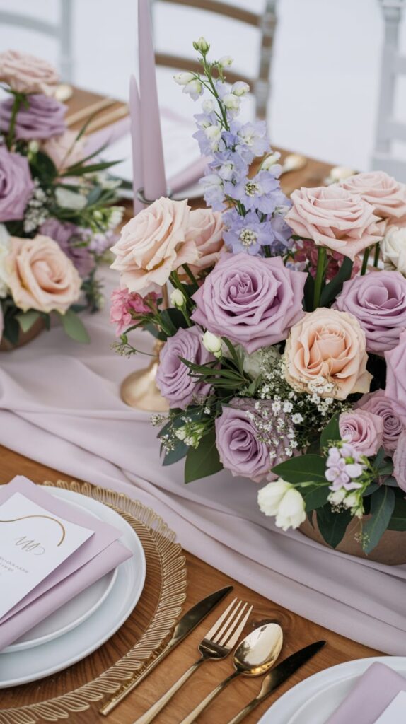
Blush & Sage Green – Timeless Garden Romance
Few palettes feel as effortlessly romantic as blush and sage green. This duo evokes the feeling of soft petals and fresh leaves on a dewy spring morning. Think cascading eucalyptus garlands, pale pink roses, and vintage-inspired glassware that catches the light. Add a rose gold table runner for a subtle shimmer that instantly elevates your tablescape without overpowering it.
Lavender & Dusty Blue – Whispers of Spring Air
Lavender and dusty blue feel like a spring morning in full bloom — cool, airy, and undeniably romantic. This combination is perfect for vineyard or garden weddings, especially during golden hour when the sky mirrors your palette. Layer in soft gauze runners, lilac-tinted candles, and a lavender garland kit to bring subtle fragrance and dimension to your reception tables.
Ivory, Champagne & Gold – Elegant Old-World Glow
There’s nothing quite like the sophistication of ivory, champagne, and gold. This palette glows under candlelight, blending modern luxury with timeless romance. It works beautifully in both grand ballrooms and intimate garden marquees. Style with ivory roses, gold-rimmed glassware, and crystal accents for that luminous, editorial finish. Display your cake on a gold cake stand to give it the attention it deserves.
Pale Pink & Soft Gray – Understated Refinement
Delicate yet modern, pale pink and soft gray is the choice for couples who want romance with a hint of restraint. The gray grounds the palette, giving your setup a contemporary edge, while the pink adds just enough sweetness. Perfect for loft venues, estate homes, or minimalist spring ceremonies. Accent with neutral ceramic vases to maintain a clean, balanced aesthetic.
Butter Yellow & White – Sunshine Simplicity
Butter yellow and white brings pure sunshine energy to your day. It’s cheerful, soft, and feels like happiness in color form. Use yellow tulips, lemon accents, and white linens for a look that feels fresh but never loud. For an elegant finish, style your tables with glass candle holders that reflect sunlight and make your palette glow from every angle.
Each of these classic spring wedding color palettes brings its own version of romance — whether that’s the soft warmth of blush, the refinement of ivory and gold, or the joy of butter yellow. They’re the colors of poetry, of spring gardens, and of love stories that never fade.
Modern & Minimalist Spring Wedding Color Palettes

For couples drawn to simplicity, texture, and understated beauty, these modern spring wedding color palettes prove that less can be absolutely stunning. Minimal doesn’t mean cold — it means intentional. It’s about layering neutral tones, subtle contrasts, and organic materials to create a look that feels both current and timeless.
White, Taupe & Olive – Quiet Luxury
White, taupe, and olive create a serene blend of soft neutrals and grounded greens. It’s the palette of effortless luxury — minimal, warm, and elegant without shouting for attention. Layer crisp linens with olive branches and neutral ceramics. A set of neutral ceramic vases ties everything together, bringing subtle texture and harmony to your tablescape.
Dusty Rose & Terracotta – Earthy Modern Warmth
Dusty rose and terracotta strike that rare balance between warmth and refinement. These tones photograph beautifully in natural light and pair perfectly with wooden tables, linen runners, and sculptural florals. Add matte finishes wherever possible — ceramic plates, clay candle holders, or a boho decor kit — to complete the modern organic aesthetic.
Peach, Cream & Mocha – Warm Neutrals with a Glow
For a color story that feels like soft light at sunset, peach, cream, and mocha is an instant winner. It’s cozy but chic — perfect for brunch weddings or intimate gatherings. Pair soft rattan textures with glass accents, and let the natural palette breathe. A set of glass candle holders adds warmth and reflection without overwhelming the simplicity.
Stone & Sage – Botanical Minimalism
Stone and sage are the modern couple’s answer to traditional pastels. Cool gray tones bring structure, while sage green introduces softness. Use clean white blooms, soft concrete candle holders, and greenery-forward arrangements. The result feels grounded, airy, and beautifully balanced — ideal for lofts, museums, or botanical garden venues.
Black, Ivory & Greenery – High-Contrast Sophistication
Black, ivory, and greenery redefine what spring can look like. This bold yet minimal palette offers instant editorial polish, blending organic textures with sleek design. Think ivory florals on black plates, minimalist signage, and lush foliage. To add warmth, incorporate metallic touches or a gold cake stand for a striking, modern contrast.
These modern and minimalist spring wedding palettes show that restraint can be powerful. When every detail is chosen with purpose — from the color of your candles to the texture of your napkins — simplicity becomes the ultimate form of sophistication.
Whimsical & Romantic Spring Wedding Color Palettes

If your dream wedding feels like it belongs in a fairytale — all soft blooms, flickering candles, and that just-after-sunset glow — these whimsical spring wedding color palettes are made for you. They capture the heart of spring: romantic, airy, and just a little bit magical.
Each of these combinations blends emotion with artistry, bringing a painterly quality to your celebration. Perfect for garden receptions, courtyard ceremonies, or countryside estates — anywhere you want love to feel like the main character.
Sky Blue & Butter Yellow – Lighthearted Joy
Sky blue and butter yellow feel like pure sunlight and laughter — cheerful, fresh, and full of charm. This palette is perfect for open-air brunch weddings or tented garden receptions. Mix white linens with lemon accents, pale blue candles, and a few blue glass candle holders to let natural light play across the tables. The result? A celebration that feels like spring bottled up in color.
Mauve & Sage – Modern Vintage Romance
Soft, soulful, and endlessly romantic, mauve and sage combine vintage appeal with modern serenity. Picture velvet ribbons, loose floral arrangements, and textured fabrics. The muted green grounds the rosy tones, creating an atmosphere that feels both nostalgic and fresh. For a cohesive, boho-meets-elegant touch, use a boho wedding decor kit to layer candles, vases, and greenery in one polished look.
Coral & Mint – Playful Garden Charm
Coral and mint is for the couple who wants their day to feel like a celebration from start to finish. Vibrant yet balanced, this duo feels refreshing and full of personality. Use coral peonies and mint linens against crisp white backdrops to keep things bright but chic. Add a mint floral garland across the dessert table or bar for a whimsical finishing detail that photographs beautifully.
Lilac & Periwinkle – Dreamy Pastel Layers
Delicate and ethereal, lilac and periwinkle evoke twilight skies and soft spring blossoms. These cool pastels create depth without contrast, making your photos feel airy and painterly. Try translucent glassware, chiffon draping, and lavender sprigs for texture. The palette pairs effortlessly with silver or gold, so you can tailor it to your venue’s mood.
Rose Quartz & Seafoam – Soft Coastal Romance
For seaside ceremonies or coastal-inspired receptions, rose quartz and seafoam blend ocean calm with tender warmth. Imagine pale pink blooms against minty-green linens, sea glass accents, and plenty of natural light. A few LED taper candles add glow to evening celebrations and keep the palette feeling breezy, not busy.
These romantic spring wedding color palettes remind us that beauty doesn’t have to be loud — it just has to feel intentional. When your colors whisper emotion instead of shouting it, every corner of your wedding feels like part of the same love story.
Bold & Unforgettable Spring Wedding Color Palettes

Spring may be known for pastels, but bold color is having its moment. These unforgettable spring wedding color palettes prove that vibrant tones can be just as elegant — when styled with balance and intention. Think of them as couture for your color story: daring, refined, and impossible to forget.
Perfect for fashion-forward couples, destination celebrations, or modern city venues, these palettes make a statement without stealing the spotlight from the romance. Each one brings personality, depth, and artistry to your day.
Emerald & Blush – Luxe Contrast
Emerald and blush is the ultimate expression of contrast — deep, dramatic greens softened by romantic pinks. It’s bold but balanced, lush but refined. Use emerald linens, blush peonies, and gleaming gold accents for a look that feels both fresh and opulent. A set of emerald green napkins adds instant dimension to neutral tables and photographs beautifully.
Lilac & Mustard – Unexpected Chic
Playful yet sophisticated, lilac and mustard bring high-fashion energy to a spring setting. This pairing feels straight off the runway — soft meets striking, pastel meets pop. Think lilac bridesmaid dresses, mustard ribbon-tied bouquets, and golden candlelight to pull it all together. For a seamless glow, use LED taper candles in warm hues that bounce off metallic accents.
Fuchsia, Peach & Gold – Celebration Energy
Fuchsia, peach, and gold radiate pure joy. This palette is confident and festive — ideal for couples who want their wedding to feel like an experience. Pair bold floral installations with peach glassware and gold cutlery to strike the perfect balance of color and elegance. Display your desserts on a gold cake stand for an extra layer of glamour that ties your palette together.
Cobalt & Buttercream – Modern Royalty
For a look that’s striking but sophisticated, try cobalt and buttercream. The deep blue adds structure while the pale yellow keeps things soft and celebratory. Use cobalt glassware, buttercream florals, and touches of gold or ivory to prevent the look from feeling too formal. The palette shines especially well in open-air or coastal venues, where light amplifies its depth.
Terracotta & Teal – Bohemian Luxe
Terracotta and teal combine warmth and coolness in perfect harmony. This palette feels earthy yet dramatic — ideal for rustic or desert-inspired weddings. Pair terracotta ceramics with teal napkins or candles for rich, layered texture. Incorporate a boho decor kit to unify tones and add instant editorial polish to your setup.
These bold spring wedding color palettes prove that daring doesn’t have to mean chaotic. With thoughtful styling and balanced tones, even the most vibrant hues can look sophisticated, intentional, and utterly chic — the kind of color story that guests will remember long after the last dance.
How to Choose Your Spring Wedding Color Palette

Picking your spring wedding color palette isn’t just about what looks pretty together — it’s about creating an atmosphere that feels like you. Your colors influence every visual element: florals, fashion, stationery, even the tone of your photography. When chosen with care, they transform your venue into a reflection of your story.
So how do you choose the perfect palette? The answer lies in balance — between your venue, the season, and your personal style. Here’s how to narrow your options like a stylist.
1. Let Your Venue Lead
Your setting is your foundation. A botanical garden glows in pastel tones like blush and sage, while an industrial loft thrives on neutrals like taupe, stone, and olive. Instead of fighting your backdrop, enhance it — your palette should echo what’s already beautiful about the space.
2. Draw Inspiration from Nature
Spring offers endless color cues — blooming tulips, soft green leaves, pale skies, and golden sunlight. Build your palette around what nature is already doing. Pull two anchor tones directly from the landscape, then add a neutral or metallic to tie them together. For example, rose quartz and sage mimic blooming florals, while sky blue and butter yellow mirror the season’s light.
3. Consider the Lighting
Natural light can make or break your palette. Blush and ivory look radiant outdoors but can wash out under warm indoor bulbs. Always test your color swatches or florals in multiple lighting conditions before finalizing. For evening receptions, use LED taper candles with adjustable tones to maintain that soft spring glow from ceremony to last dance.
4. Balance Bold and Soft Tones
The trick to an elevated palette is contrast. Pair one statement color with two supporting neutrals. For instance, emerald, blush, and ivory feel luxurious, while fuchsia, peach, and gold read joyful but still balanced. Mixing light and dark tones adds visual depth and helps your decor photograph beautifully from every angle.
5. Test Your Palette Digitally
Before you commit, build a digital mood board in Canva or Pinterest. Drop your shades side-by-side and adjust saturation until the tones feel cohesive. Sometimes a small tweak — swapping gold for champagne, or mint for sage — can completely elevate your look. Keep your final board handy for vendors to ensure consistency across florals, linens, and stationery.
6. Think Beyond Color — Add Texture
Texture brings a palette to life. Pair matte with glossy, soft with structured, organic with metallic. A linen table runner beside polished glassware creates instant dimension. Try layering a rose gold runner with neutral ceramics to add quiet luxury without extra color.
7. Stay True to Your Story
Trends come and go, but your wedding should feel timeless to you. If you’ve always loved lavender, use it. If you and your partner met at the beach, weave in seafoam or sandy neutrals. The most memorable palettes aren’t the boldest or the most “Pinterest-perfect” — they’re the ones that feel authentic.
At its heart, your spring wedding color palette is an emotional decision. When the colors make you smile, calm you, or spark nostalgia, you’ve found the perfect match — a palette that reflects both your season and your story.
From Mood Board to Aisle – Styling & Decor Ideas by Color Story

Once you’ve chosen your spring wedding color palette, the fun begins — bringing those colors to life through styling and decor. The secret to a cohesive design isn’t matching every shade perfectly; it’s repeating your tones in subtle, layered ways so the whole scene feels naturally connected.
Think of it as a visual rhythm: a touch of your main hue in the florals, a whisper of it in your signage, and a glow of it in your candlelight. Here’s how to translate your mood board into a wedding-day masterpiece.
Centerpieces & Florals
Keep your floral arrangements true to your palette’s personality. For a blush and sage wedding, blend roses, ranunculus, and eucalyptus for a fresh, garden-like feel. If you’re going bold with emerald and blush, use structured greenery and layered textures to add drama. Arrange everything in neutral ceramic vases — they ground colorful arrangements and transition beautifully into home decor afterward.
Tablescapes & Place Settings
Your table is the heart of your reception — it’s where design meets function. Layer linens, flatware, and glassware in complementary tones for visual depth. A rose gold table runner instantly elevates pastels, while emerald napkins or matte black cutlery can make modern palettes pop. Mixing materials — wood, metal, linen — adds texture without chaos.
Lighting & Ambience
Lighting is what turns a beautiful setup into something cinematic. For spring weddings, soft and golden always wins. Hang string lights over open-air receptions, scatter votives across long tables, or illuminate pathways with lanterns. LED taper candles with adjustable hues create that warm flicker without worrying about wind or wax. The glow they cast on soft tones like blush, ivory, or sage makes every photo look editorial.
Cake & Dessert Design
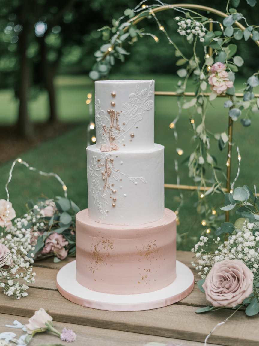
Your cake is a perfect canvas to echo your palette. A white buttercream cake with fresh florals captures classic romance, while a watercolor or semi-naked cake introduces a modern touch. Accent it with edible gold leaf or hand-painted petals. Display your masterpiece on a gold cake stand set — it instantly ties your color story together and elevates the entire dessert display.
Small Touches That Make a Big Impact
The smallest details often make the biggest difference. Scatter rose petals along the aisle, use ribbon-tied flatware, or coordinate your signage with your palette’s accent color. Even subtle additions — like tinted glassware or pastel-colored candles — create a cohesive experience. Remember, consistency always outshines quantity: every element should echo your color story, not compete with it.
These spring wedding styling ideas prove that editorial-worthy design doesn’t require a huge budget — just thoughtful layering of color, texture, and light. When each element speaks the same visual language, your celebration feels intentional, elevated, and effortlessly romantic.
Expert Tips & Budget Hacks for Spring Wedding Colors

Designing a stunning wedding doesn’t have to mean overspending. The most elegant celebrations often come down to creativity, not cost. These expert-approved budget hacks help you achieve that polished, cohesive look without compromising your vision — or your wallet.
Reuse and Repurpose Decor
Choose versatile pieces that can move from ceremony to reception. Aisle arrangements can double as table centerpieces, while neutral ceramic vases look just as lovely on a dessert table as they do at the altar. Keeping your palette consistent allows every reused element to blend seamlessly.
Lean Into Neutrals
Start with a neutral foundation — white linens, glassware, and wood tones — and add color through affordable accents like candles, runners, or napkins. A single rose gold table runner or set of emerald napkins can shift your entire aesthetic for under $30.
Mix Fresh and Faux Florals
Blending real blooms with high-quality artificial ones keeps arrangements lush without inflating costs. Use real flowers for focal points like bouquets and ceremony arches, and faux versions for filler greenery or overhead installations. A lavender garland kit is a great example — it adds fullness and fragrance without wilting before the reception ends.
Rent Instead of Buy
Large decor items like archways, chargers, and lighting fixtures are often used once — so rent them instead. Save your buying budget for smaller statement pieces that double as keepsakes, like your cake stand or ceramic candle holders. Those are the details that add personality and can live on in your home long after the big day.
Shop Seasonal
Spring florals are naturally abundant, so focus on what’s in season — tulips, ranunculus, lilacs, and peonies. They’re fresher, more affordable, and fit perfectly with spring’s color story. Pair them with greenery or simple white blooms to stretch your floral budget further without losing visual impact.
Think DIY, but Keep It Chic
Simple projects like hand-painted signage, ribbon-tied cutlery, or printed seating cards can look editorial with the right materials. Stick to your palette and invest in quality basics like LED candles or linen-textured paper. DIY doesn’t have to mean amateur — it can mean personal and perfectly on-brand.
With these budget-friendly wedding styling tips, you can create a celebration that feels luxurious, intentional, and uniquely yours — all without stretching beyond what’s comfortable. In the end, it’s not about how much you spend; it’s about how thoughtfully you tell your color story.
FAQ – Spring Wedding Color Palettes

Still fine-tuning your color story? These expert answers cover the most common questions couples ask when planning their spring wedding color palette — from timeless combinations to modern styling tricks that make your design look effortless.
What are the best color palettes for a spring wedding?
The most popular spring wedding color combinations include blush and sage, lavender and dusty blue, and ivory with gold. These palettes photograph beautifully in daylight and pair effortlessly with natural greenery. For something bold, try emerald and blush or fuchsia, peach, and gold — both bring modern energy to classic spring romance.
How many colors should my wedding palette include?
Three to five is ideal. Choose one dominant hue, two supporting shades, and one or two accents (metallics or neutrals). This balance adds depth without feeling overwhelming. For instance, lavender, sage, and ivory feel airy, while terracotta, taupe, and gold add warmth and richness.
What’s the most budget-friendly way to match my colors?
Start with a neutral base — white linens, wood textures, or glass tableware — and add color through affordable accents. A rose gold runner or LED candles instantly enhance your palette without requiring a complete decor overhaul.
Can I mix pastel and bold colors for spring?
Absolutely. Pairing a statement color with soft neutrals keeps your design balanced. Emerald with blush or fuchsia with ivory are beautiful examples. The key is restraint — let your bold tone appear in small doses, like napkins, florals, or stationery, rather than dominating the entire space.
Which flowers work best for spring wedding palettes?
Spring offers a dream lineup: tulips, peonies, ranunculus, lilacs, garden roses, and anemones. For pastel palettes, keep arrangements airy and romantic. For bolder schemes, introduce greenery or textured blooms for depth and movement. Mix fresh stems with a few faux lavender garlands to extend fullness affordably.
How can I make my palette look luxurious?
Luxury is all in the layering. Use textures — silk napkins, velvet ribbons, metallic accents — and repeat your tones throughout the decor. A few strategic upgrades, like a gold cake stand or crystal glassware, elevate the entire aesthetic without major expense.
Can bold colors still feel timeless?
Yes — the secret is balance. Pair strong tones like fuchsia or emerald with classic neutrals such as ivory, champagne, or soft gray. This combination grounds vibrant hues and gives them longevity in photos and memory alike.
What’s the easiest way to make my colors feel cohesive?
Repeat your main hue at least three times across different areas — in florals, linens, and paper goods. The repetition creates harmony, even if your decor pieces vary. Consistency is more important than perfect color matching; the eye naturally connects repeated tones.
Still exploring? Browse more inspiration from our wedding guides:
📌 Love these ideas? Save this guide to your wedding board on Pinterest and revisit it as you refine your design plan.
Closing Reflection

At the end of the day, your spring wedding color palette is more than decoration — it’s the language your celebration speaks. The right shades can turn a simple space into something poetic: pale pinks that whisper romance, sage greens that calm, and golden tones that glow like sunlight through leaves.
I still remember helping a friend plan her mint-and-peach garden wedding on a shoestring budget. We spray-painted dollar-store vases, layered thrifted linens, and tucked fresh herbs into napkin rings. When the candles were lit and the music started, the whole space looked like something out of a bridal editorial. That’s the magic of thoughtful color — it makes every detail feel intentional, no matter the price tag.
So whether you’re drawn to whimsical pastels, modern neutrals, or bold contrasts, trust your instincts. Choose hues that reflect your story — the way you laugh together, the places you love, the memories you’re building. When your colors feel true to you, your wedding won’t just look beautiful — it will feel unforgettable.
📌 Love these dreamy ideas? Pin this guide to your wedding board for later inspiration.
📌 Planning your big day on a budget? Save this editorial-style palette roundup to help design your perfect color story when it’s time to decorate.


[…] you’re drawn to seasonal tones, explore curated spring palettes here: Spring Wedding Color Ideas. It’s an ideal starting point for building a wildflower-inspired look that still feels […]