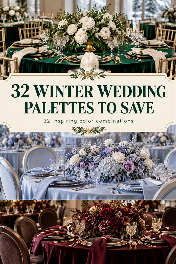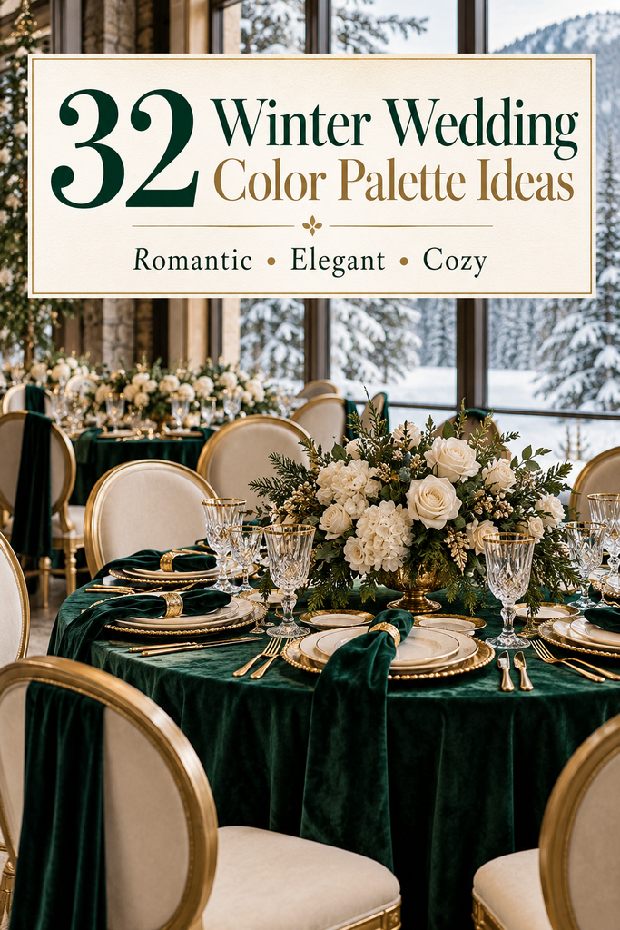
32 Winter Wedding Color Palette Ideas
Winter weddings give you so many beautiful directions to take your décor. You can lean into snowy whites and icy blues, create a cosy reception with warm neutrals, or fill the room with rich jewel tones and velvet textures.
Your colours don’t have to revolve around red and green, either. A winter wedding can feel romantic, modern, dramatic, or wonderfully understated without looking like a Christmas party.
The trick is choosing a palette that works with your venue and repeating it thoughtfully through your flowers, wedding party outfits, stationery, and tables. These 32 winter wedding color palette ideas will help you picture the possibilities—and decide which details deserve each shade.
This post may contain affiliate links, please refer to privacy policy for more information.
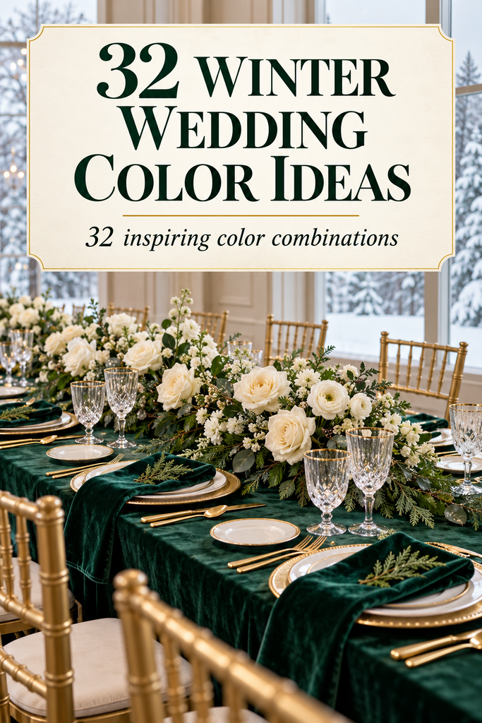
1. Emerald Green, Ivory, and Gold
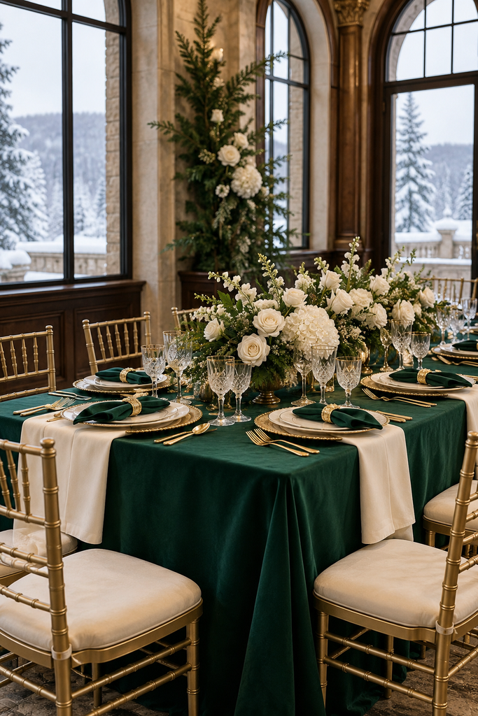
Emerald brings depth, ivory keeps the look soft, and gold adds a warm finishing touch. Picture emerald velvet bridesmaid dresses, ivory flowers, and gold-rimmed glassware against crisp ivory linens.
Keep the biggest surfaces light so the green feels intentional rather than overwhelming. At the reception, emerald napkins and a few gold details can carry the palette without needing green tablecloths on every table.
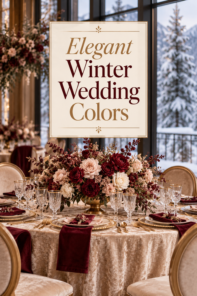
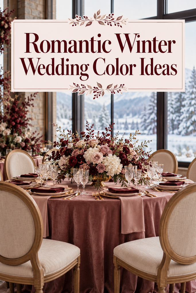
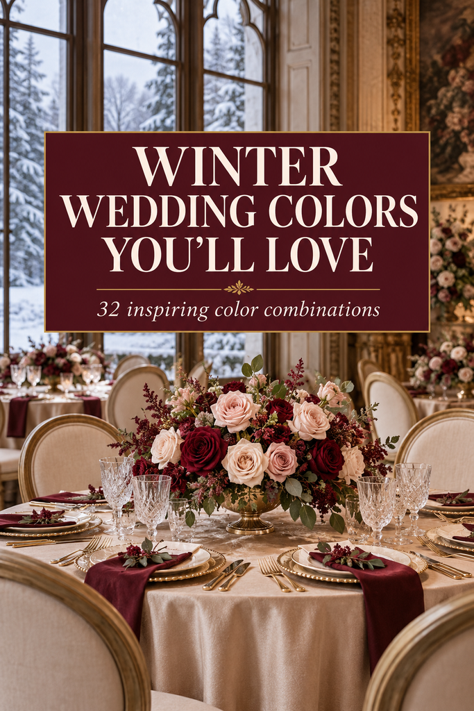
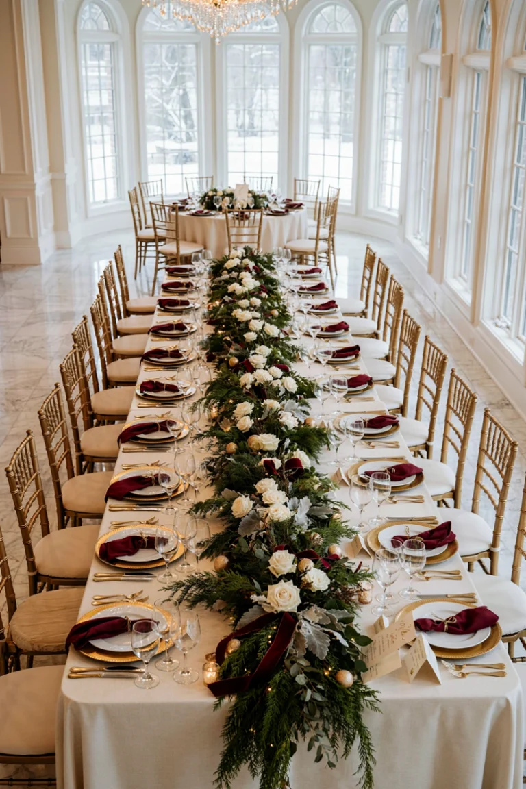
2. Burgundy, Blush, and Champagne
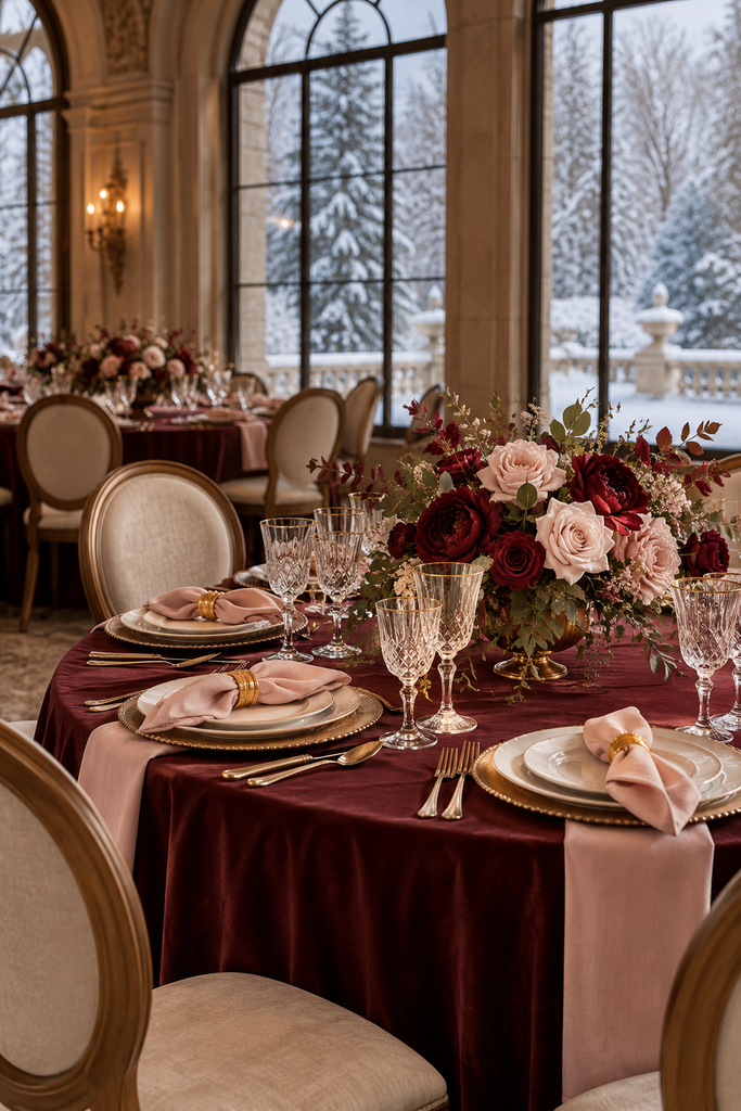
This combination balances rich winter colour with a gentle, romantic finish. Burgundy flowers and dresses create the focal points, while blush ribbons and champagne linens soften the room.
Try bouquets with burgundy and pale pink blooms rather than matching everything to one shade. Champagne-toned stationery ties the colours together beautifully, especially with a burgundy envelope or ribbon.
3. Navy Blue, Silver, and White
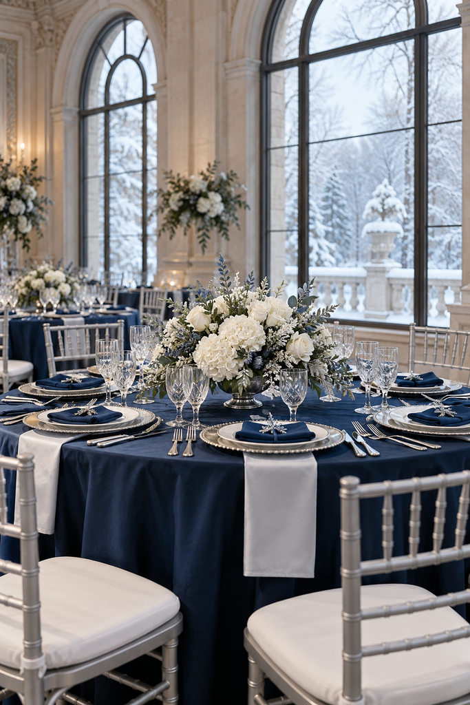
Navy, silver, and white create a crisp winter look that suits a formal evening celebration. Navy suits or bridesmaid dresses give white flowers a striking backdrop, while silver accents echo the cool tones.
Use white table linens, navy napkins, and clear glass vases to keep the reception bright. Silver frames for table numbers add polish without making every surface sparkle.
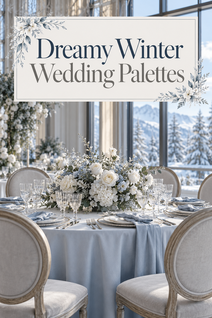
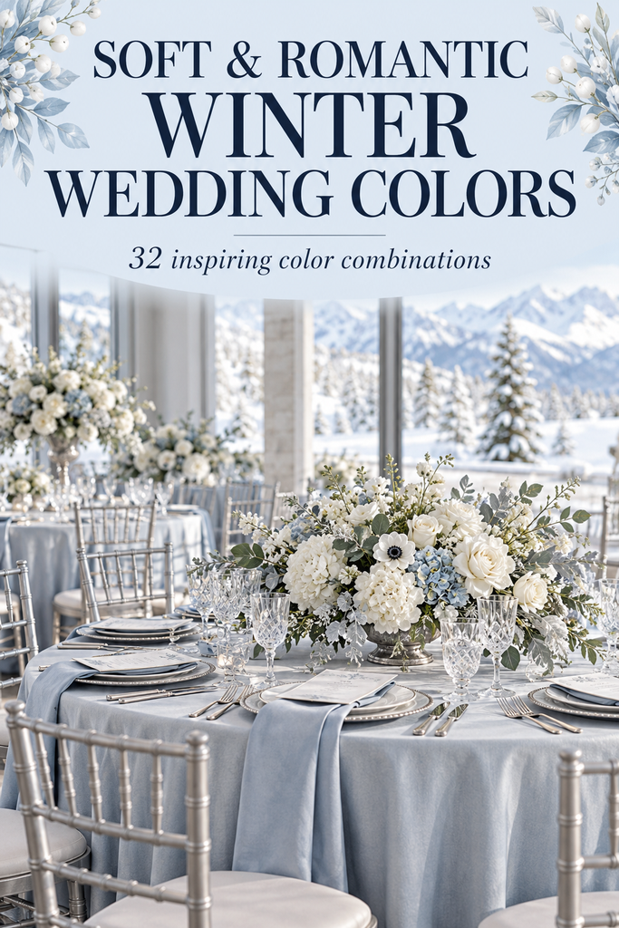
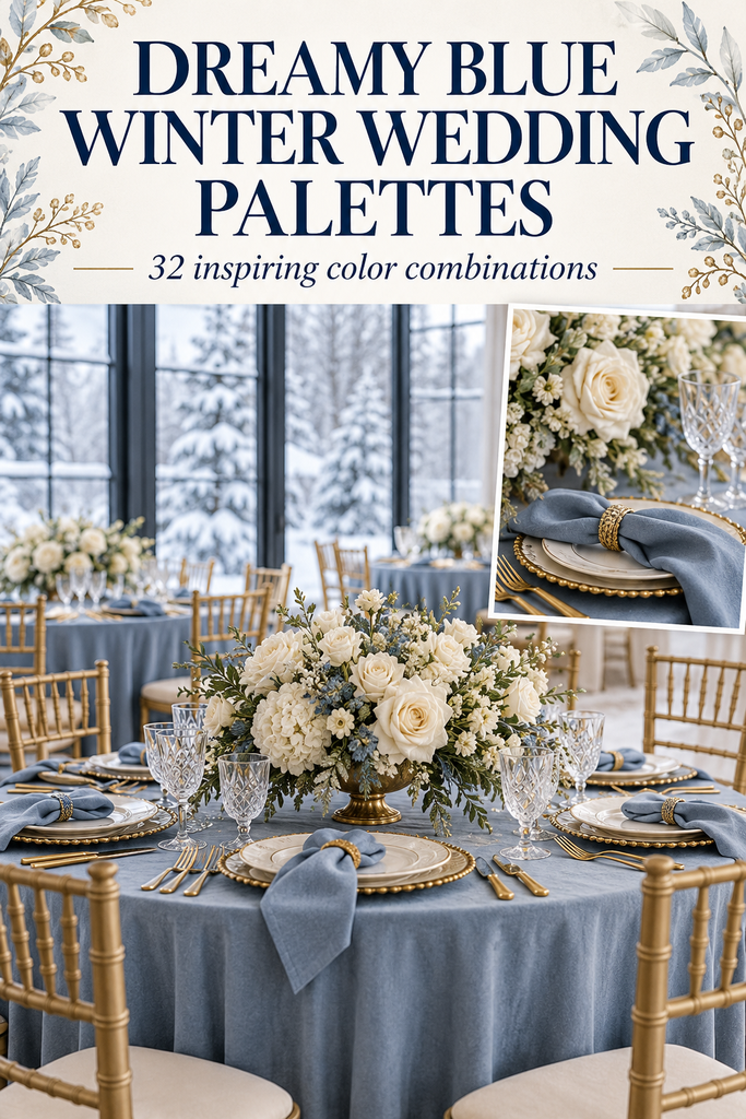
4. Ice Blue, Pearl White, and Soft Grey

For a snowy, airy atmosphere, pair delicate ice blue with pearl white and pale grey. This palette feels especially pretty in a venue with large windows and plenty of natural light.
Choose pale blue stationery, white floral arrangements, and grey suits or linens. A sheer blue table runner gives the tables colour while preserving that light, almost frosted appearance.
5. Forest Green, Cranberry, and Cream
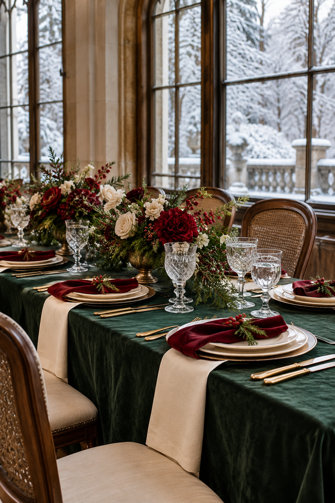
Forest green and cranberry bring a seasonal feel, while cream makes the combination warmer and less stark. Use deep green foliage, cranberry-coloured flowers, and cream table linens for a cosy reception.
To keep the look wedding-focused, skip bold holiday patterns and spread the colours across simple details. Cream stationery with forest green lettering and a cranberry envelope is a lovely starting point.
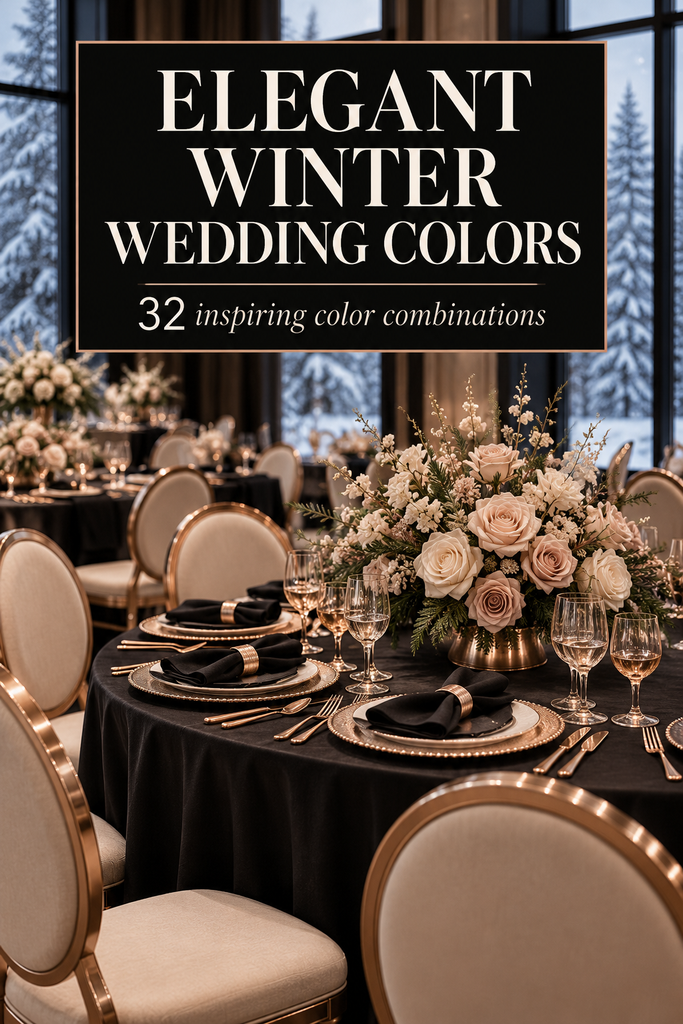
6. Black, White, and Gold

This palette is a natural fit for a formal city wedding or an evening reception. Black attire and stationery create definition, white flowers lighten the tables, and gold adds warmth.
Try white tablecloths with black napkins and gold flatware. Choose one or two gold finishes to repeat rather than mixing lots of different metallic decorations.
7. Dusty Blue, Slate, and Ivory

Dusty blue offers a softer alternative to navy, while slate gives the palette enough depth for winter. Ivory flowers and linens prevent the overall effect from becoming too cool.
Mix dusty blue bridesmaid dresses with slate suits, then repeat the blue in menus or napkins. This combination works beautifully with clear glass, understated arrangements, and simple typography.
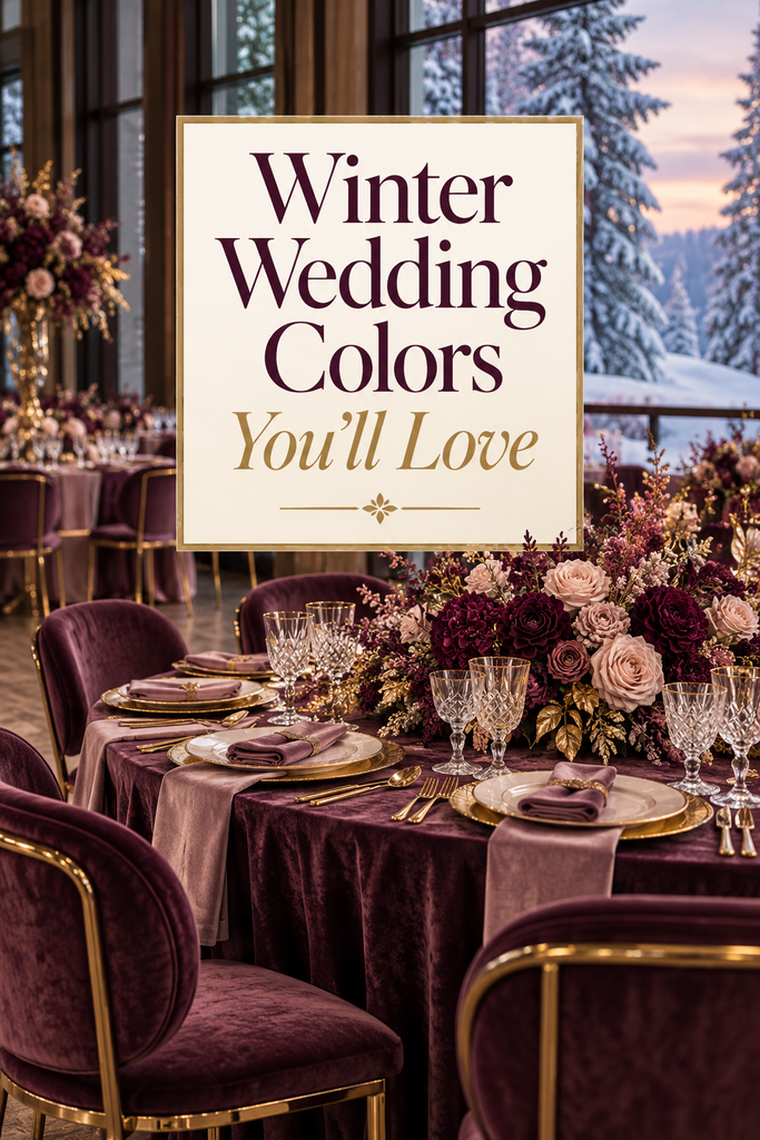
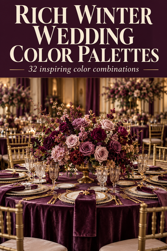
8. Plum, Mauve, and Antique Gold
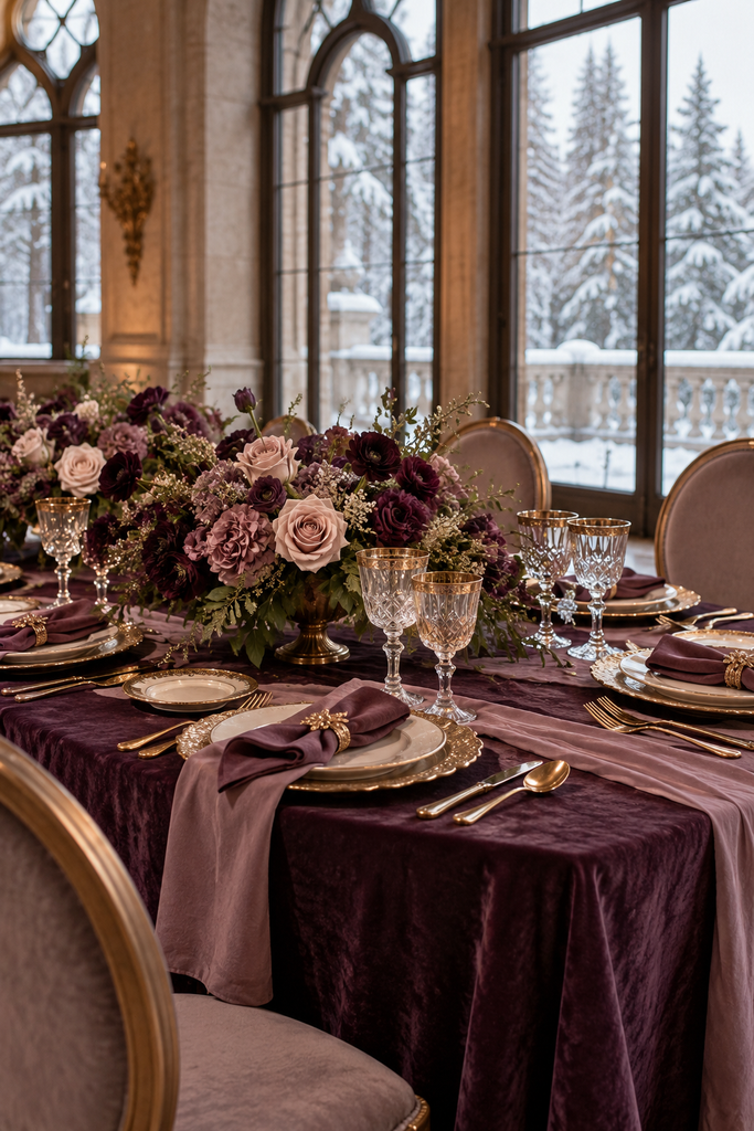
Plum and mauve create a layered purple palette with a romantic, slightly vintage feel. Antique gold adds warmth and suits venues with wood panelling, ornate mirrors, or historic details.
Let plum appear in the dresses or napkins, then use mauve and ivory flowers to soften it. Aged gold frames and muted gold stationery accents complete the look without overpowering the purple tones.
9. Sage Green, Taupe, and Warm White
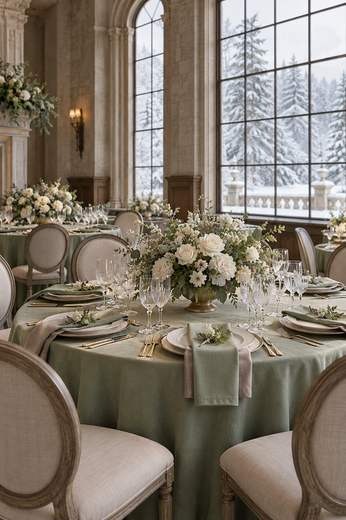
Sage, taupe, and warm white are lovely for couples who prefer quiet colour over dramatic contrasts. The palette feels natural and relaxed, particularly with wood furniture and textured fabrics.
Use sage napkins, taupe stationery, and warm white flowers with loose greenery. To give it a winter feel, add heavier linen textures and layered place settings instead of relying on pale colours alone.
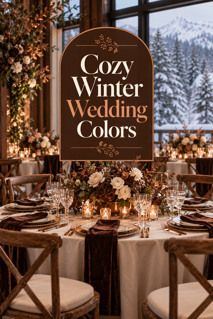
10. Chocolate Brown, Copper, and Cream
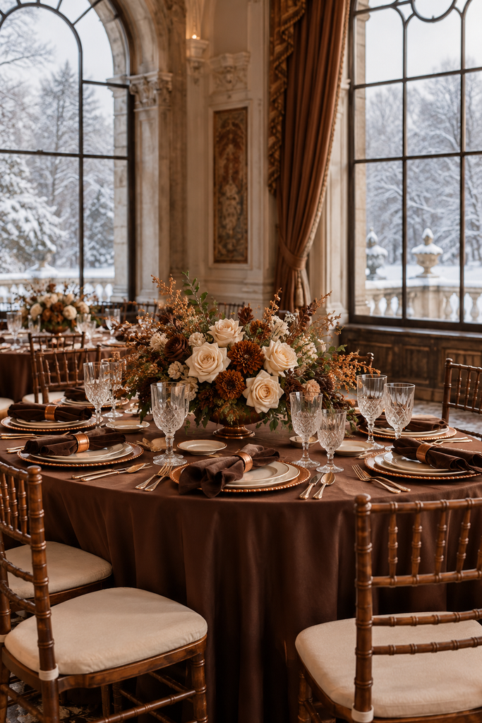
Chocolate brown makes an inviting base for a winter wedding, especially in a lodge or timber-filled venue. Copper adds a warm metallic glow, and cream keeps the tables from feeling too dark.
Picture chocolate napkins, cream flowers, and copper-toned table number holders. Brown velvet ribbons around bouquets or menus are a small detail that makes the whole palette feel considered.
11. Ruby Red, Black, and Ivory

Ruby red is bold and romantic, particularly when framed by black and ivory. Make the flowers the main red feature, with black attire or signage and ivory reception linens.
A mostly ivory table setting lets ruby arrangements stand out. Keep red accents focused on a few places, such as bouquets, napkins, or envelope liners, to avoid making the room visually crowded.
12. Midnight Blue, Champagne, and Gold
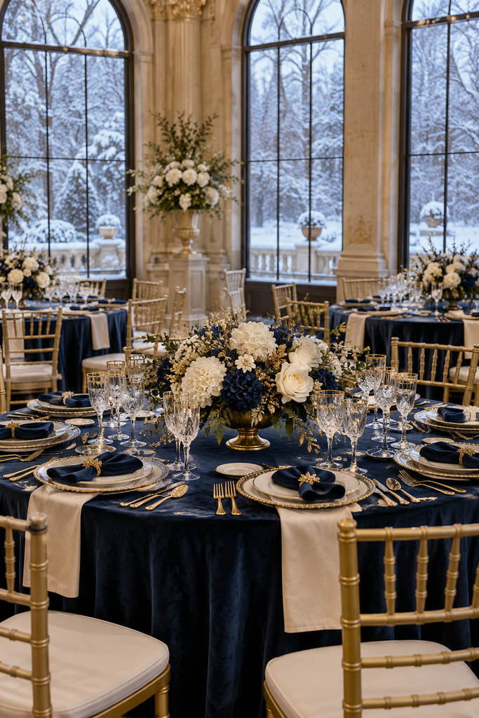
Midnight blue creates a dramatic evening atmosphere, while champagne and gold make the palette feel warm. It’s a beautiful combination for a ballroom reception or a subtle celestial theme.
Choose midnight blue dresses or table runners, champagne flowers and linens, and restrained gold stationery details. If you include stars, use them sparingly on paper goods so the theme stays elegant.
13. Dusty Rose, Burgundy, and Warm Ivory
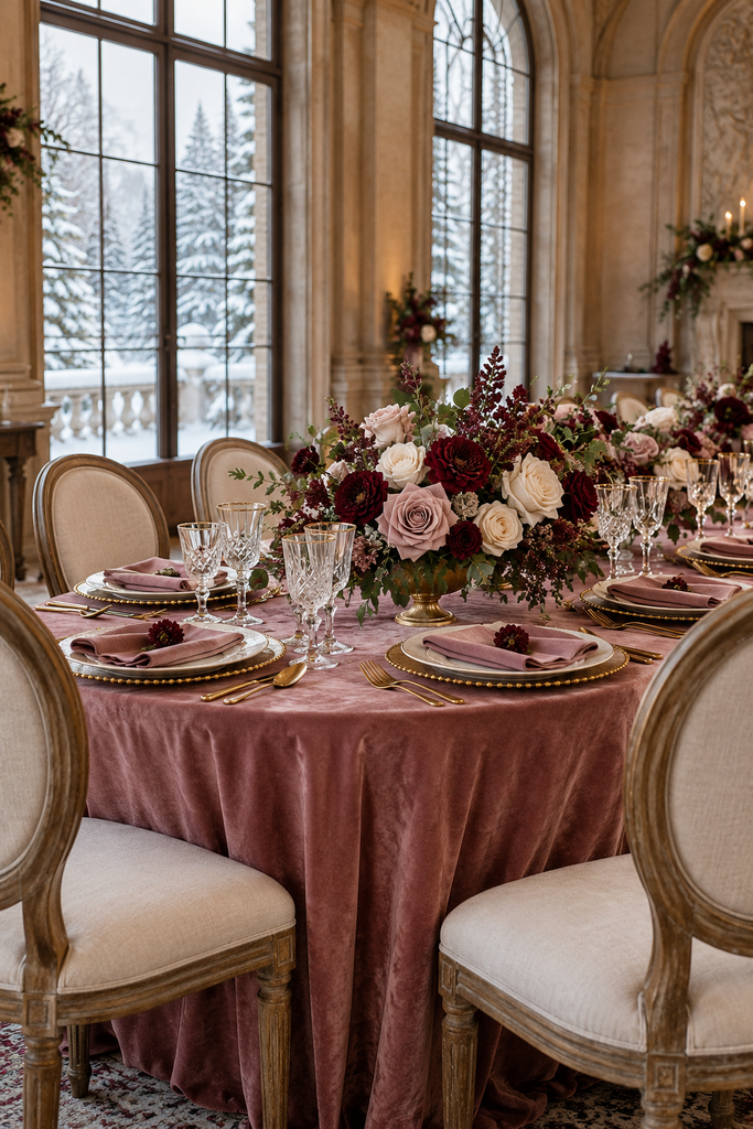
Dusty rose and burgundy offer a romantic palette with more depth than an all-pink scheme. Warm ivory acts as the backdrop, giving both colours room to stand out.
Try dusty rose bridesmaid dresses with bouquets that include burgundy focal flowers. At the reception, carry burgundy through napkins and use mostly pale arrangements for a balanced look.
14. Aubergine, Charcoal, and Silver
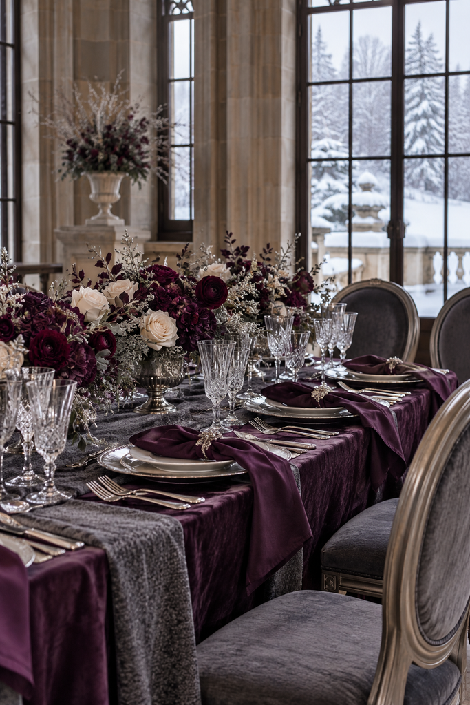
Aubergine is a deep purple that feels dramatic beside charcoal and silver. This palette suits a contemporary winter wedding with clean lines and an evening reception.
Use charcoal attire, aubergine napkins, and silver-toned accessories. Include lighter flowers within the arrangements so their shapes remain visible against the darker décor.
15. Terracotta, Cinnamon, and Ivory

Warm earthy colours can look beautiful in winter, particularly in a rustic or intimate venue. Terracotta and cinnamon bring warmth, while ivory gives the scheme breathing room.
Combine terracotta dresses with ivory flowers and cinnamon-coloured ribbons. For the tables, use ceramic vessels and textured linens; keep dried accents restrained if you want the result to feel wintry rather than autumnal.
16. Teal, Pewter, and White
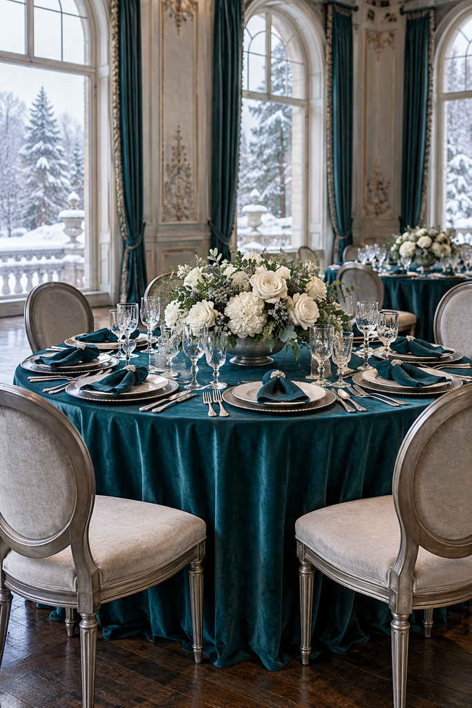
Teal is a striking choice if you love blue and green but want something a little different. Pewter adds a muted metallic finish, while white brings clarity to the palette.
Let teal dresses or napkins carry most of the colour. Pair them with white flowers, pewter-toned frames, and simple glassware for a reception that feels polished without being overly ornate.
17. All White with Silver Accents
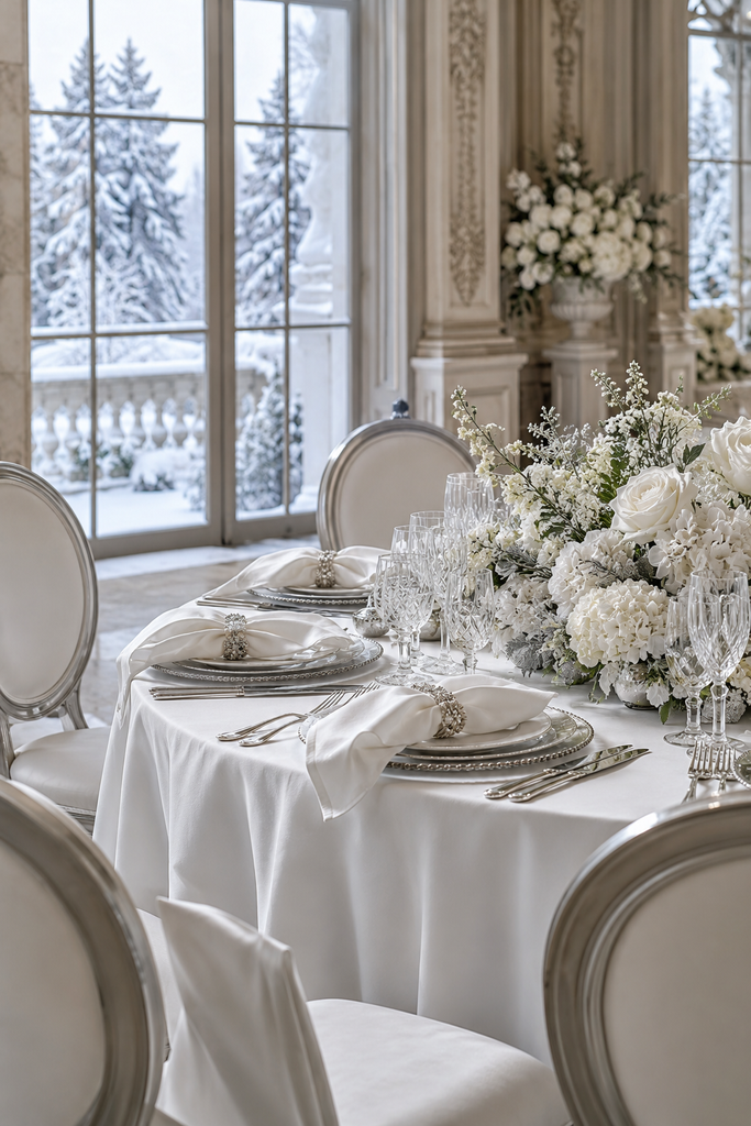
An all-white winter wedding can feel beautifully layered when you mix textures and shapes. Think white flowers, ivory-toned fabric, translucent signage, and clear glass with small silver touches.
Check fabric samples beside one another before ordering, because bright white and creamy white can look quite different. Use texture—such as satin, linen, and ribbed glass—to give the scheme interest.
18. Champagne, Ivory, and Gold

Champagne, ivory, and gold create a soft, warm reception without a strong colour contrast. This palette is especially useful when your venue already has ornate architectural details.
Choose ivory flowers, champagne napkins, and gold accents on menus or place settings. Mix matte fabrics with a few reflective details so the room has depth instead of one uniform beige tone.
19. Evergreen, Black, and Brass
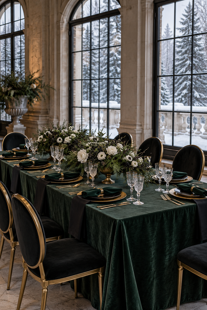
Evergreen, black, and brass combine natural colour with a modern edge. Black chairs or signage anchor the scheme, evergreen dresses or linens provide richness, and brass brings warmth.
Use foliage with white flowers to brighten the tables. Repeating brass in small pieces, such as table number stands and vase details, helps connect the décor without requiring a large metallic display.
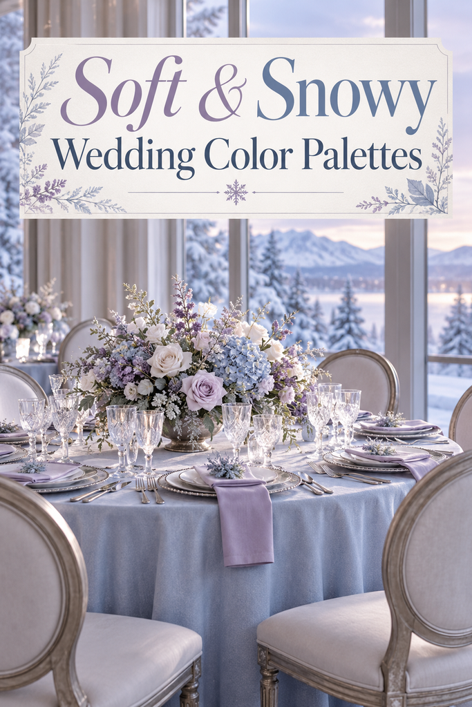
20. Lavender, Frosted Blue, and Silver
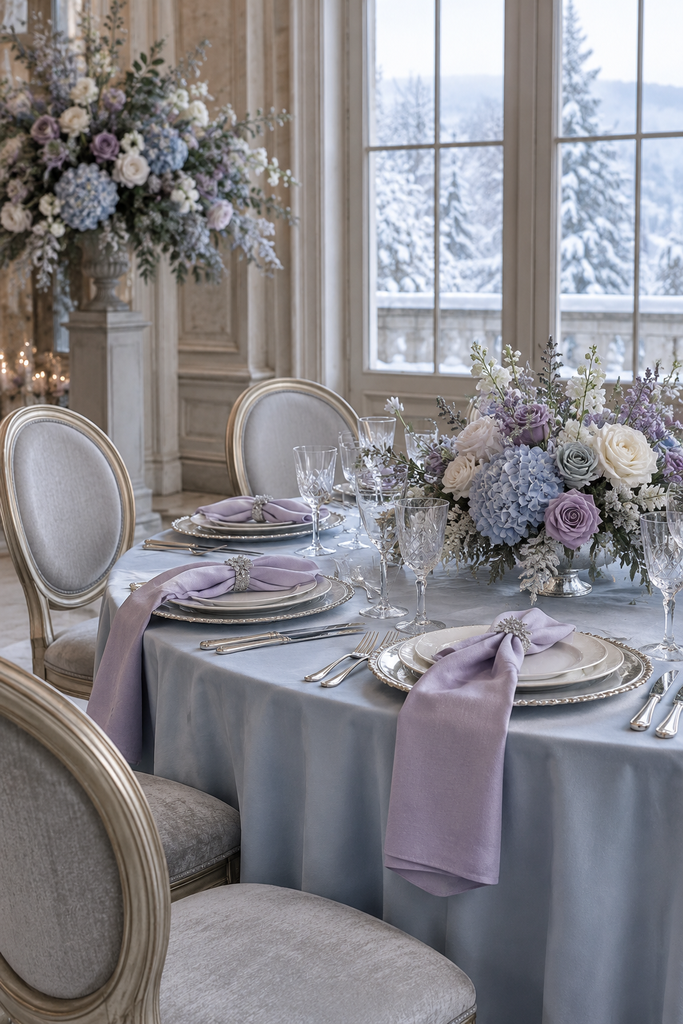
Lavender and frosted blue make a gentle, cool-toned palette with a dreamy winter feel. Silver details complement both shades without introducing a strong warm contrast.
Try lavender dresses, pale blue napkins, and white flowers with touches of purple. Keep the lavender muted and the blue pale if you want a delicate look rather than a bright pastel party.
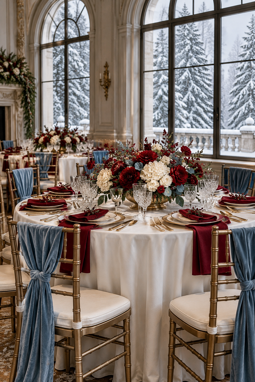
21. Cranberry, Dusty Blue, and Ivory
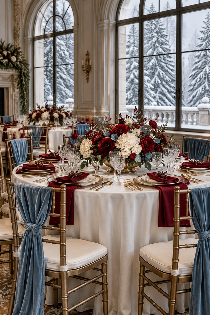
Cranberry and dusty blue offer an unexpected mix of warm and cool colour. Ivory acts as the connecting neutral, making the contrast feel balanced.
Use dusty blue dresses with cranberry and ivory bouquets, then reverse the emphasis at the reception with cranberry napkins on ivory tables. Matching the shades across stationery helps the combination feel cohesive.
22. Steel Blue, Charcoal, and White
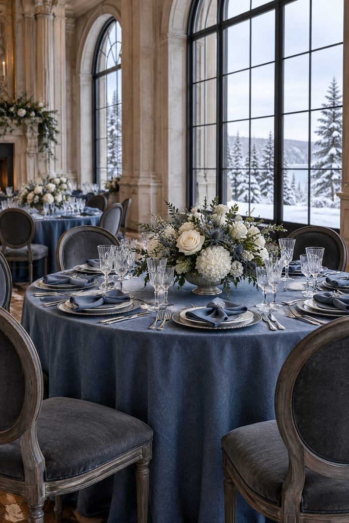
This palette is crisp, understated, and well suited to a modern venue. Steel blue brings subtle colour, charcoal adds definition, and white keeps the overall look clean.
Choose steel blue napkins or dresses, charcoal suits, and white floral arrangements. Minimal stationery and uncluttered table settings work particularly well with these shades.
23. Moss Green, Caramel, and Cream

Moss green and caramel create a cosy woodland-inspired palette without leaning heavily into holiday colours. Cream lightens the scheme and works beautifully against natural wood.
Use moss green fabrics, caramel ribbons, and cream flowers with textured foliage. Carry the caramel into leather-look stationery accents or warm brown place cards for a subtle, coordinated finish.
24. Raspberry, Plum, and Blush

For couples who want expressive colour, raspberry, plum, and blush offer a rich floral palette. Raspberry adds brightness, plum supplies depth, and blush softens the contrast.
Make the arrangements the main feature and keep table linens neutral. Mixed bouquets can carry all three shades, while plum dresses or raspberry napkins repeat just one colour elsewhere.
25. Navy Blue, Copper, and Ivory
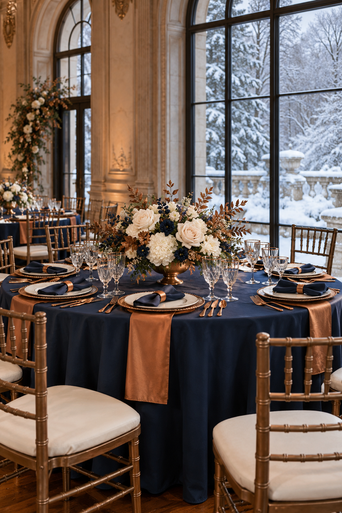
Navy and copper create a warm alternative to navy and silver. Ivory flowers and linens soften the contrast, making the palette equally suited to a formal reception or a cosy historic venue.
Try navy napkins with copper-toned chargers or stationery foil. Let copper appear in small accents so it supports the navy rather than becoming the dominant colour.
26. Pearl Grey, Blush, and Silver
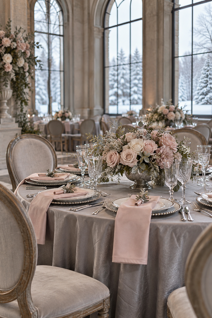
Pearl grey, blush, and silver are delicate without feeling overly sweet. Grey grounds the pink, while silver adds a subtle winter finish.
Use grey linens or suits, blush flowers, and silver-toned accessories. A little deeper rose in the bouquets can add definition if the pale shades look too washed out in your venue.
27. Peacock Blue, Emerald, and Gold
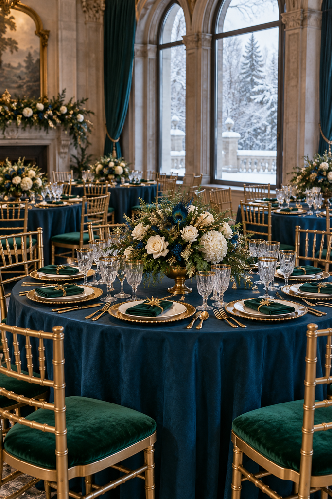
Peacock blue and emerald make a bold jewel-tone combination, with gold bringing the colours together. This palette suits a reception where you want the fabrics and flowers to make a statement.
Choose one jewel tone for the largest feature, such as dresses or linens, and use the other in smaller details. Add ivory flowers or light place settings to break up the saturated colours.
28. Burgundy, Burnt Orange, and Cream

This warm palette bridges autumn and winter beautifully, especially for an early winter wedding. Burgundy gives it depth, burnt orange adds warmth, and cream keeps the scheme welcoming.
Use burgundy dresses with flowers in muted orange and cream. Rich fabrics and simple arrangements help the colours feel appropriate for winter without needing pumpkins, leaves, or other autumn motifs.
29. Black, Champagne, and Rose Gold
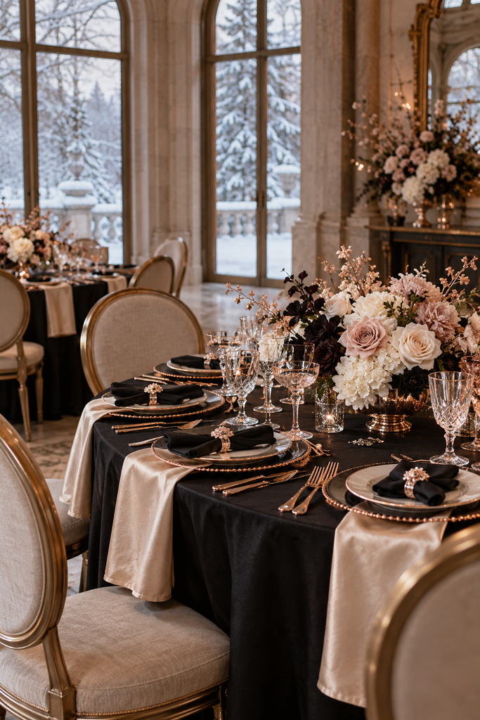
Black, champagne, and rose gold create a glamorous palette with a softer finish than classic black and gold. Champagne fabrics give the room warmth, while rose gold works best as a small accent.
Try black stationery, champagne napkins, and rose gold details on place cards or accessories. Check metallic samples together so pink-toned accents don’t clash with copper-coloured rental pieces.
30. French Blue, Cream, and Antique Gold
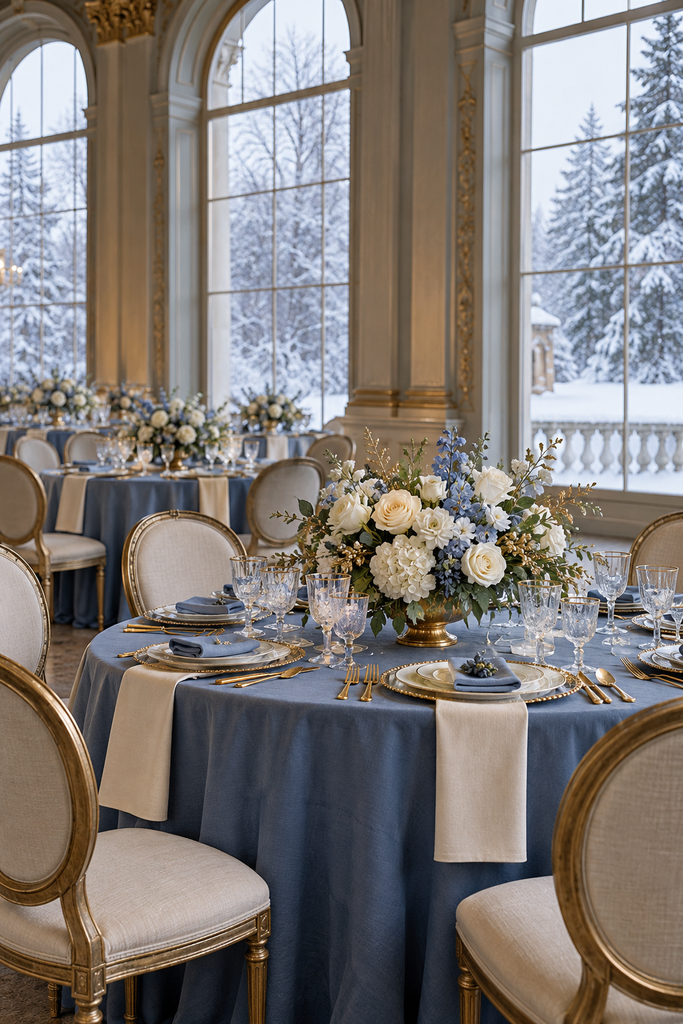
French blue is a muted medium blue that brings more colour than icy pastels while staying soft. Cream and antique gold give it a romantic, traditional feel.
Use French blue ribbons or napkins, cream flowers, and aged gold frames. This palette is particularly lovely with patterned stationery or delicate tableware, provided you keep the patterns limited to a few details.
31. Juniper Green, Mist Grey, and Silver
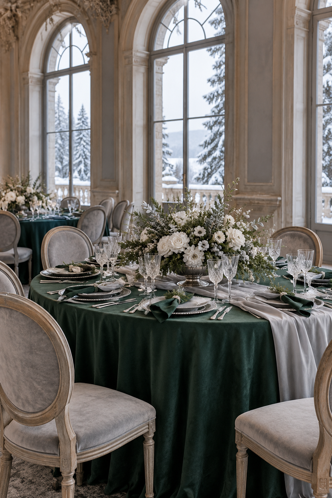
Juniper green has a cool, slightly blue cast that pairs beautifully with mist grey. Silver reinforces that quiet winter feel without adding a contrasting warm tone.
Choose juniper-coloured dresses, grey napkins, and white flowers with greenery. Keep the arrangements loose and the table settings simple for a natural, understated reception.
32. Merlot, Espresso, and Soft Gold
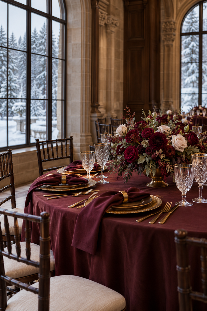
Merlot and espresso create a deeply romantic palette with plenty of warmth. Soft gold brightens the darker shades and gives the scheme a formal finish.
Use merlot dresses or napkins, espresso-coloured stationery, and muted gold accessories. Include cream flowers and lighter linens where needed so the room feels inviting and the details remain easy to see.
How to Choose Your Winter Wedding Color Palette
Start with your venue. Its walls, flooring, furniture, and lighting will be part of your wedding photos, so look for colours that work with what is already there. A timber lodge and a bright white ballroom may call for very different versions of the same palette.
Next, choose one main colour, one supporting colour, and one neutral or metallic accent. You don’t need to give every shade equal space. For example, an emerald, ivory, and gold wedding might use mostly ivory linens and flowers, emerald dresses and napkins, and just a few gold details.
Before committing, compare actual fabric and paper samples in daylight and in lighting similar to your reception. Photos on a screen can make dusty blue look grey, burgundy look purple, or champagne look yellow.
Finally, talk through your flower colours with your florist. Share the overall palette and the feeling you want, then ask which flowers can achieve it for your date and budget. A beautiful colour scheme doesn’t depend on every flower or decoration matching perfectly.
A Winter Wedding Palette That Feels Like You
The best winter wedding colors are the ones you’re excited to see throughout your celebration. That might mean emerald velvet and ivory flowers, a snowy blue-and-white reception, or warm chocolate and copper details in a cosy lodge.
Choose a combination you love, give each colour a clear role, and let your venue help shape the final look. A few thoughtfully repeated shades can make the entire celebration feel connected.